 This installment of the Take Two series shows how to shrink a double-page template from the Premium Membership library into a single-page layout. I will be creating a hybrid layout – one in which my process uses digital tools to create a traditional, paper layout.
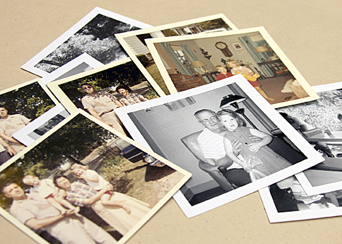
I wanted to create a layout using some square photos, taken with a Kodak during one of my family’s road trips in the early 1960s. Most of the photos from my early youth were taken with the same Kodak. The quality of the photos isn’t great, but back then, film and processing were expensive and my parents took photos sparingly. I treasure the photos despite their quality and I believe the photo of me with my grandfather is the only one ever taken of the two of us together.
I went searching the Simple Scrapper library for a suitable template to use as a page sketch and found a double-page one in the December 2011 Collection.
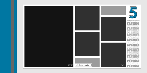
Simple Scrapper Template from the December 2011 Collection
My original take on this template focused on our family’s relaxed Thanksgiving holiday vacation.
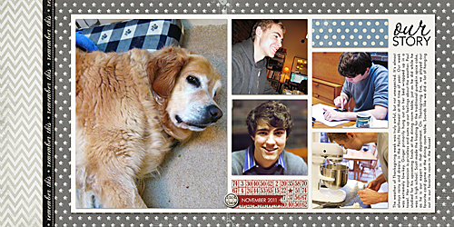
Supplies: Jessica Sprague/Heidi Swapp Winter Wonderland papers; Robyn Meierotto papers; Echo Park Paper Co. border; Splendid Fiins brad; Ali Edwards word art; Anna Aspnes paper and stitching
Visualize
Looking at the template, I knew I wanted to use the five photos and the journaling strip in a one-page layout. After opening the template in Photoshop, I used the crop tool, set at 20” x 12”, to help me visualize the area of the template that I wanted to use in my new layout. I didn’t use the tool to actually crop anything, however.
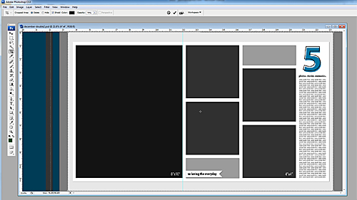
Delete Layers
I deleted the layers in the template that I would not be using in my new layout.

New Canvas
I created a new 12” x 12” canvas and drug the layers over. You’ll notice that the journaling strip and title are not on the new canvas. As I brought the items into the new 12” x 12” canvas, it was evident that the journaling location and orientation would need to be changed. I sized the photos to take up the maximum horizontal space. The extra layers were still part of the template but not visible on the screen.
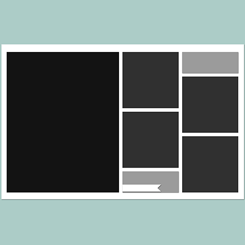
Make Adjustments
I moved the location of the title/word art and reoriented the journaling box to be horizontal rather than vertical.
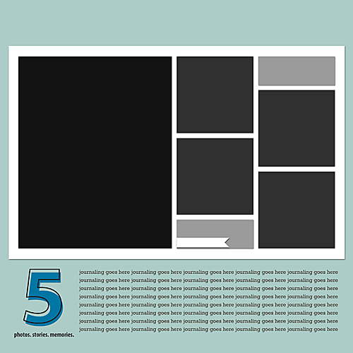
Add Photos + Journaling
I placed the scans of my original photos into the template and added white borders. I also wrote the journaling and added it. Finally, I created some star embellishments in Photoshop to serve as placeholders for paper embellishments in my final layout. I didn’t have my exact set of embellishments chosen, but wanted something in that bottom left corner so that I could better assess the layout at this point.
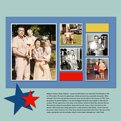
Another Adjustment
It may sound crazy, but because I scrap digitally more often than with traditional supplies, I forgot that I wouldn’t be able to print my journaling directly onto my background paper since I don’t own a large format printer. I extended the mat on which the photos were resting and created a background paper for my journaling. Knowing that I would be using a journaling card as a mat for my chipboard alpha, I added my title digitally to better help me visualize my embellishments.
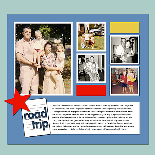
Finish
At this point it was time to print my photos and journaling and assemble my layout with my papers and minimal embellishments. As I stated earlier, the quality of the photos isn’t great, but I’m thrilled to have been able to reconstruct a little bit of my early childhood history on a scrapbook page. To be honest, these photos weren’t even stored together in the photo box; they were scattered among several hundred photos from that time.
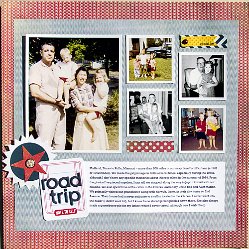
Road Trip Supplies
Another Take
As I was finishing up the article, I couldn’t help but begin to see yet another template variation – achieved by rotating the photos 90 degrees clockwise and putting the title and journaling strip to the left. If I were to make a layout from this version of the template, I’d likely replace the vertical paper strips with an embellishment of some sort.


Thank you ! Great post.