Team member Ronnie Crowley will be sharing ideas and inspiration from our team for the reader challenge each month.
This month’s Simple Scrapper challenge:
Create a layout using a 3×3 grid, based on the following sketch. Digital scrapbookers may download a free template.
Use the template/sketch to create a “miscellany” layout – one in which you use the squares to tell your story with layers – boxes can be photos, paper with embellishments, mix and match. You can take a very open interpretation or you can stick very closely to the template.
Suggestions for changes that can be made to the template:
- Consider making the 9 squares smaller.
- Add journaling spots underneath the pictures.
- Reduce the grid to a 3 by 4 grid
- Consider using this template for scraping an event where you have no pictures and using papers and elements to tell the story.
The Simple Scrapper Team created layouts as inspiration for the challenge:
Mandy Ross used lots of square pictures to record her birthday trip. She chose to use one of the squares as a journaling block rather than the strips in the template which allowed her to include more details. (credits)
Pam Lozano created a delightful page about how to make a child smile. (credits)
Pam liked the template enough to make a second layout and created a totally different look. I really like the big “US” and how she framed the grid with the strips. (credits)
Aimee Maddern used the template to record a week in her life. Look at how she uses a mix of alphas to create her title. (credits)
I love the layout Amy Kingsford’s created about her shoes. She kept the basic grid design but moved her embellishments around the page to help tell the story. (credits)
Jean Watson Manis chose to scrap a trip to the beach using some fun embellishments to create clusters to help tell the story. The shades of orange, green and blue work perfectly together and that wave at the bottom creates a great resting place for the title. (credits)
For my layout this month I chose to do one without any pictures at all and used patterned papers and embellishment instead to tell the story about my daughter. (credits)
Lisa Corbin-Polak recorded the return of her daughter for the summer vacations, including pictures of the ‘things’ she brought back with her. The story gives you a glimpse into what important to a student. To make more room for more pictures and embellishments she added the journaling round the outside of the grid. (credits)
Valerie Mangan shrank the grid and used an 8 1/2 x 11 base creating lots of great white space. She then moved the brief journaling down to the lower right for balance. (credits)
Sue Althouse added some large stars across the top of her page and the grid. She continued the stars in her title work which draws the eye down the page and balances these large stars. (credits)
Margrethe Aas Johnsen layout “Be You” takes the largest step away from the template. Instead of taking the grid as her inspiration she chose to take the inspiration from all the embellishments on the template. I love the message she included in this layout. (credits)
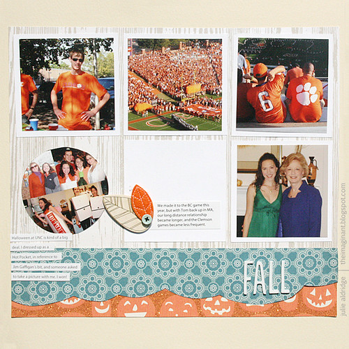
Julie Aldridge celebrates fall with her layout replacing the bottom third of the grid with a title block. (credits)
Now it’s your turn! Win $15 print credit from Persnickety Prints by taking on this month’s Simple Scrapper challenge by August 25, 2012. Visit our challenge area for instructions on how to enter!


ty