Can you believe it? My baby girl started preschool this fall. Seriously.
For a little bit though, we weren’t sure if potty training was going to keep her in the toddler class for a while longer.
We were taking an easy-going approach, but all of a sudden there was a deadline upon us. Then, a friend from college passed along the 3 day method. And it worked!
Emily was able to start preschool with the friends she’d been in class with for the past two years! We were thrilled.
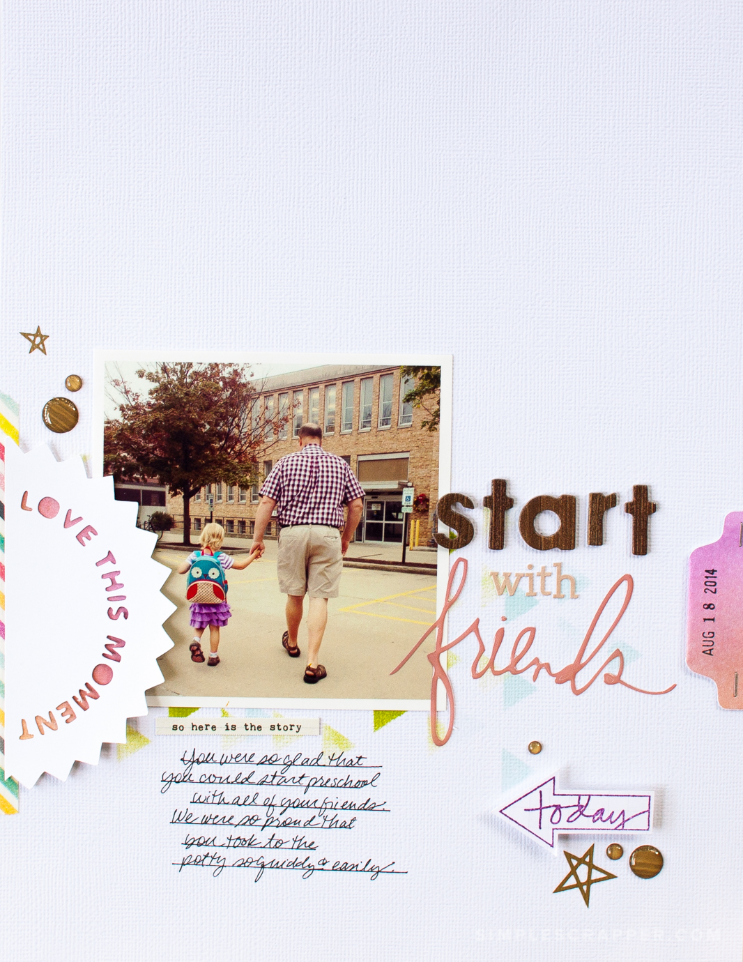
I printed this photo I took on her first day at home with my Epson PictureMate printer.
This layout illustrates one of my favorite approaches for designing a page. I choose a focal point, then build outwards and layer upwards.
I began with an 8.5×11 sheet of textured cardstock and a Kelly Purkey triangle stencil. Using a dauber and three colors of Studio Calico Color Theory inks, I stippled a background onto the cardstock.
This technique was revolutionary for me, someone who has always been disappointed in misting. The color layered on lightly and was build-able.
The rest of the layout came together quickly as I created a band design with an emphasis to the left. I had the most fun combining word and letter stickers for my title.
Most notable is that I used just one piece of patterned paper here, for punching the tag on the right.
I finished off this page with a few lines of journaling, writing directly on textured cardstock using hand-drawn lines.


Gorgeous! Love all the details on this page 🙂
Thank you!
Thank you for posting, Jennifer. I always enjoy reading about your page process. I had to lift this page, actually, LOL (http://bit.ly/1wMBEbI). Thank you for the inspiration!
Gorgeous! I love how you did the title work.. and well, everything!
Love the layout and detailed instructions. I am going to borrow the idea for a photo I took Saturday morning of our first dusting of snow!
Love this page, Jennifer and the idea is easily adapted to 12X12!