A few weeks ago, we shared some inspiring tips to help you make the most of journaling tags. In this post, we’ll offer 10 more ways to help you think creatively in terms of journaling placement and formatting. If you love a layout you see here, don’t forget to visit the galleries and leave some love.
1. Fill the white space
2. Think narrow
3. Fade into the background
4. Play hide and seek with your text
5. Think in circles
6. Remember right justification
7. Mix and match fonts, alphas and your journaling
8. Create your own word art
9. Fill in the box
10. Think balancing thoughts
—
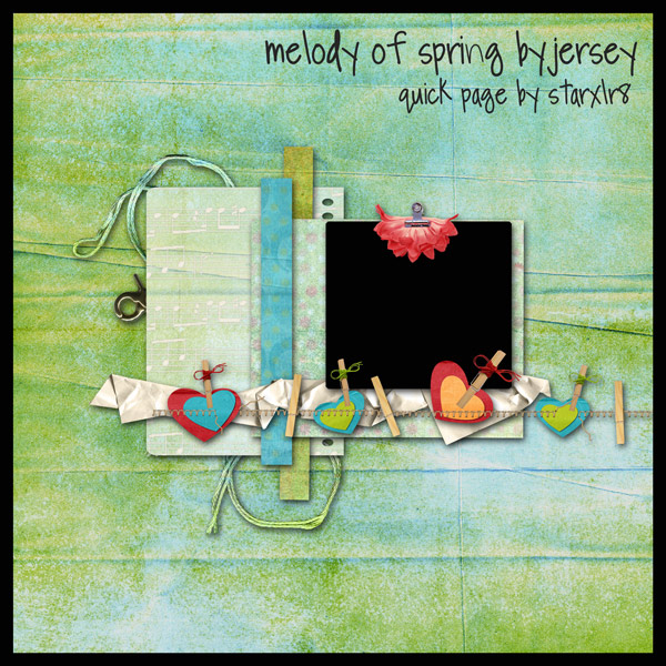
This week’s freebie comes from the new Melody of Spring kit by Jersey. In keeping with the theme of this post, there is a great space for journaling all ready!

Download link expired


Thanks for the journaling inspiration! One of my goals this year is to journal more on my layouts, so this was inspirational. Hope you’re feeling better!
Christine (supertwinkle)’s last blog post..It Hurts When I Push Here
I like the idea of creating your own word art. I’ve been experimenting with that lately
Stacey~ComfyMom’s last blog post..Weekly Winners – week 8
LOVE the QP, thanks so much! That’s Q for Q and UTE for ute, CUTE!
You would have to know Clyde Crashcup to appreciate that I guess 🙂
I had to google Clyde Crashcup – but I’m glad you like the QP.
Journaling is certainly a challenge. I’m trying to convince myself that its an essential part of a layout, so that I work it into my initial design.
Thank you so much for the page.
Thanks for the beautiful freebie! I’m enjoying the tips too, journalling is not my strong point, so I need to work on it!
Thanks for the lovely freebies and the tuts, very useful to me as I’ve been away from digiscrapping for a while.
The qp is so DARLING. Thanks for sharing it.