White is the new black, or so it seems. The use of no background paper and instead a pure white canvas (or a stark white, lightly textured paper) is popping up in increasing numbers. I have to admit, it creates a striking, eye-popping design. I even jumped on the bandwagon this week and created two layouts with the new “anti-background”.
What do you think of this trend? Feel free to share a link to a layout you’ve created with a white background. In keeping with today’s tip, Simple Scrapper has a freebie from Project B Designs using the new Funky Daydreams kit.

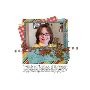
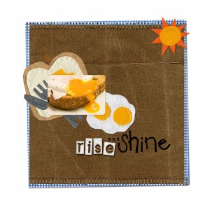
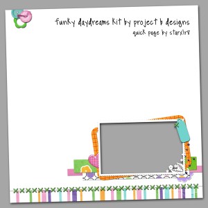
I’ve done a couple of pages like this, and I like them. I would think this is a good way to scrap if you were printing your layouts at home, because it uses less ink. Come to think of it, it’s a good way to scrap for sending your pages out to print too. As long as you stay away from the edges, you wouldn’t have to worry about page bleed and trim.
Christine (supertwinkle)’s last blog post..Will Do Taxes For FroYo
It is a fine idea and very cool, but I would not do a lot like this, or all like this but it would be fun to switch it up and try something different.
Tiffany’s last blog post..Eat then Sleep page
I have noticed the white trend as well – I just have wondered how the light textures print – things look different on the screen vs page sometimes! So, looking forward to trying some of them 🙂
Thanks for the freebie – love it.
Donna (tootlebugz)’s last blog post..Digital Scrapbook Freebie – CU Tree2 -Layered PSD file
I think they look great, but I have a really hard time making a LO with a pure white background, for my own scrapping it always looks to plain! LOL
Eve’s last blog post..Spring Cleaning — Free Gift!!