In February, I suggested using default settings to simplify the drop shadow process. Indeed, this tip works really well for element-centric layouts, like the one illustrating that post. However, it does not hold true for pages with significant paper layering. The effect of default settings on layered papers is not quite realistic.
First, let’s review the three settings for creating a drop shadow.
- Size – the width of the shadow
- Distance – the displacement of the shadow from the element
- Opacity – the degree of blackness of your shadow (100% is black)
We’ll reference these as Size-Distance-Opacity. In the “soft edge” default, the settings are 42-20-75. In “low”, they are 20-20-75. As I mentioned, these settings work well for making elements pop off the page, particularly ribbons and strings. But let’s investigate what can make those digital papers look just like their in-real-life counterparts.
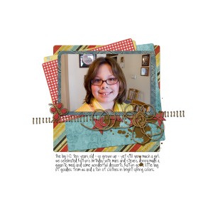
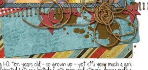
Here’s a series of examples based on a layout I completed for a scraplift challenge at The Digi Chick (credits).
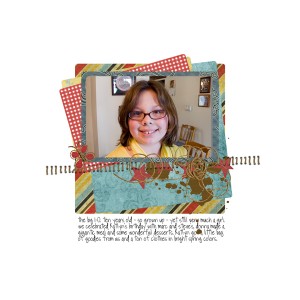
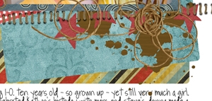
No shadows
Default – All “low” (20-20-75)
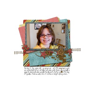
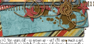
Custom – Paper shadows set to 5-5-75 and element shadows to “low” default, except felt stars to 10-10-75.
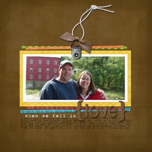
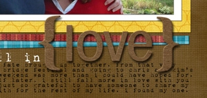
Here’s another example, also with papers at 5-5-75 and the chipboard title at 20-20-75.
An all-default layout certainly doesn’t look bad. However, if you’re craving the look of freshly cut and glued paper and are ready take on some intermediate scrapping skills, this custom approach can take you there.
Bonus Tip – Sometimes 5-5-75 is just too subtle and 9-9-75 will give the papers more dimension. This is particularly the case when your background is a patterned paper. On my examples, the backgrounds were solid, so a smaller shadow worked perfectly. Experiment to find out what looks best for you.
While these tips do add a level of tinkering to your layouts, having them in your design toolkit will take your layouts to the next level!

Good tips! Not sure about PSE, but in PSCS3 you can save your custom shadow settings as a style and use it over and over again by clicking the button in the style palette.
Christine (supertwinkle)’s last blog post..Viva La Vida