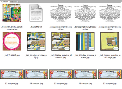
A few days ago, I wrote about 9 ways to find more hard drive space. Several readers asked for more detail on #2, where I recommended deleting duplicate files. My secret is Adobe Bridge, which is packaged with PSE for Mac and CSÂ products. (PSE for Windows still comes with Organizer.)
I use Bridge to sort, browse and tag my digital supplies. I’m not going to evangelize about this application, as I’m still looking for my holy grail of digi-organizers. However, Bridge does have a fantastic feature which aids in duplicate removal.
Adobe Bridge has x-ray vision of sorts. Look for the “Click to view all items in this folder and its subfolders” icon to browse everything at once – your entire stash if desired. The files are automatically sorted alphabetically, making it easy to quickly spot duplicate files.
What about previews?
Often designers will include a preview labeled folder.jpg AND a preview labeled with the kit name. If you’re not using the folder.jpg preview to help visually sort your stash, it is a duplicate too. However, alphabetical sorting won’t work in this case. Here’s my recommendation.
Tag all of your previews first, then use the “x-ray vision” technique to look at all previews. This should narrow down the selections so that you can browse through and look for duplicates. Think of this challenge like a game of memory, where you’re spotting look-a-likes.
Simple Scrapper answers your questions every Saturday!


I used to use Bridge too… until I discovered ACDSee by taking a class with Heidi at JessicaSprague.com I personally feel it’s the “Holy Grail” of organizers 🙂 Thanks for all the tips you’ve given!
*sniff* I used ACDSee too, until I got an iMac. That is the only thing I miss about my PC. There is a Beta version of ACDSee available now, but none of the tagging I do will be transferable to the main version when the beta expires in Feb. 2010. So, I’ve committed myself to learning Bridge instead, and I’m definitely warming up to it:) Any tips I read are awesome, so thanks once again!
OK – don’t know if you can answer this, but I have a Bridge question. Is there a way to change the preview background colour to anything but white? Vellum elements and white rub-ons don’t show up since they blend in with the background, and if you were able to change it to a different colour this problem would be eliminated. This was one of my fav. features in ACDSee. Thanks!