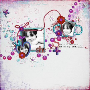
Black and white photos are a unique way to add beauty and creative interest to your scrapbook layouts. If you ever needed a reason to go b&w, here’s a list to get you started:
1. To invoke nostalgia…
2. To show emotion…
3. To de-emphasize interest areas…
4. To showcase artful composition…
5. To contrast with color…
6. To let the digital art shine…
7. To complement kit colors…
Do you use black and white photos in your layouts? If so, what is your “reason”?


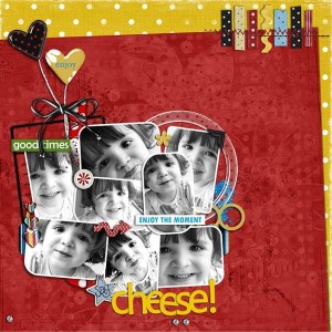
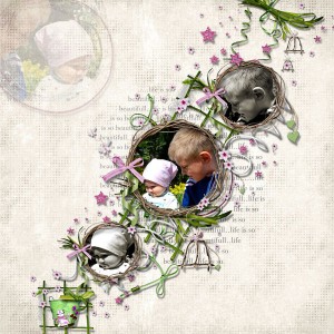
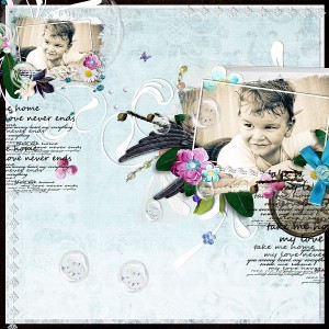
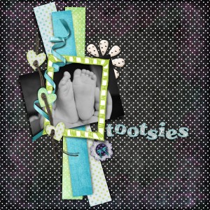

I find I often use B&W to make photos that don’t work well together color-wise fit into a cohesive layout. When I have several photos from one event and the colors are all over the place, and I can’t unify the photos with a kit’s colors, then if I turn them B&W my choices for kits are now endless!
Love your samples illustrating the options, lovely layouts!
I often find it useful for those too touch to correct, faded pictures from days past. Sometimes the color is so faded that it can’t be restored and a b&w or nice sepia tone is the perfect solution.
Great Post!
Great list!