I’ve heard from several readers that I should spend more time sharing what makes my favorite layouts so special. Here are five from the recent galleries that caught my attention.
1. Preschool by Crissy: I love how the photos are truly the emphasis here, supported by “rough” but simple elements. A few words and a date are all that are needed for this story. The different photo treatments add an extra touch of vintage to this page.

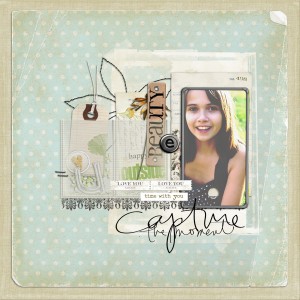
2. Capture the moment by Nath: While I would have liked to see some journaling about the subject, the layering on this is so beautiful. The shadows are perfectly done and the transparency of various layers adds dimension.
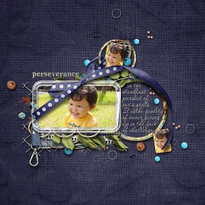
3. Perseverance by komashyaru: The realism on this layout is simply amazing. I think dark backgrounds really make elements “pop” and they’re flying off the page on this one.
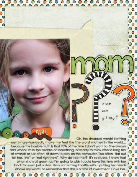
4. Can We Play? by Valgal: A beautiful photo is complemented with a great story in this rectangle layout. To me, the imperfection of this page is what scrapping is all about. I can identify with this scrapper and I want to know more about her. It’s personal.
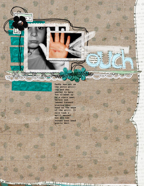
5. Ouch by azrood : Sometimes injury photos are challenging to scrap. I love how the scrapper used a new technique to do selective colorization – what a great way to emphasize a portion of your photo.
Please leave some comment love for these ladies!
Should Fab Five be a new Simple Scrapper series? How often would you like to see me pick and write about eye candy I spot in the gallery?

i like it! it would be nice every two weeks or so…
absolutely helpful! once a week or once every two weeks would be perfect.