I am a firm believer that every layout we view, paper or digital, can teach us something new. Once in a while, I’d like to have a teach-in, where I choose 10 layouts from a gallery and we all share one thing we learned from each layout. It doesn’t need to take a lot of time. There are no specific rules. Your responses can be serious or clever.
According to Wikipedia, teach-ins are meant to be practical, participatory, and oriented toward action. So simply share what you will take away from each of these lovely digital pages. You can click on each image to visit a larger version at the original source.
#1
I learned that I can sometimes scale down elements to be extra cute.
#2
I learned that fresh papers in timeless colors and patterns can work well with heritage photos.
#3
I learned that a very well-placed stitches and tape can really anchor a dimensional page.
#4
I learned that papers can be used like ribbons, in full strips across a page.
#5
I learned that a bottom left shadow looks great and is not often used.
#6
I learned how a nicely shadowed date marker provides great immediate context for a page.
#7
I learned that beautiful photos should never play second fiddle to scrapbook products.
#8
I learned that stitching makes a great frame for a photo.
#9
I learned how changing the colors in a block of journaling is great for emphasis.
#10
I learned how tucking photos under and over can give a realistic effect.
What did you learn?

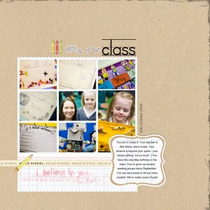
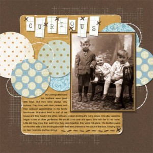
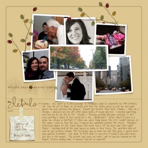

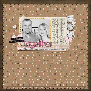
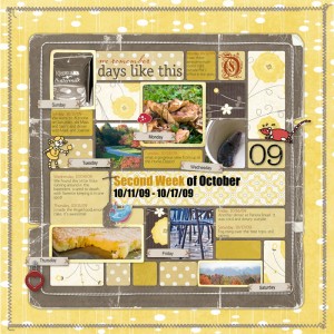

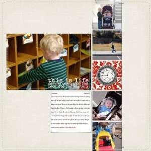
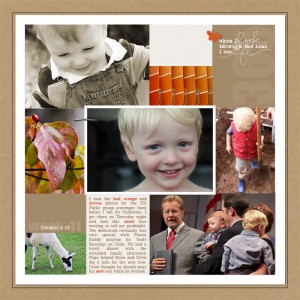
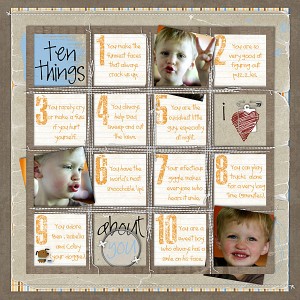
#1 – I learned you can leave white space without leaving a LOT of white space.
#2 – A single accent color really livens up a monochrome layout
#3 – breaking the borders of spaces creates a more casual look to the layout.
#4 – when everything touches something else it creates a sense of cohesiveness.
#5 -that while the shadow should be consistent on the page, you can adjust the angle depending on the items your shadowing. Sometimes using a different angle will make your items look better.
#6 – letting the photos go over the bounds of the color block areas creates a nice casual look.
#7 – vibrant photos need subdued papers to shine.
#8 – a variety of perspectives on photos really helps tell the story.
#9 – you can mix BW and color photos if the BW tone is consistent with another portion of the layout like the bg
#10 – it’s worth the effort to weave things.
Thanks for doing this! It’s fun to examine why a layout tickles our fancy!
I’ve been doing searches for ages to find a tutorial
for ” photo in and out of a frame” like in #10
or maybe it’s called weave a photo
can some one please help me
thanks
Joann – what program are you using? I’d be happy to put one together for you quickly, but it would probably help you if I do it for your program/version!
Jenn White
ScrappersWorkshop.com
1. Accenting 2 edges of a background can be fresher and just as effective as accenting all 4
2. Allowing the page title to overlap the photo helps bridge the two elements so they relate to one another better.
3. A broad stroke on the photo edges helps separate overlapping photos
4. Allowing the top layer of the layout to extend past the edges of the background looks fresh and relaxed.
5. Patterned background paper doesn’t detract from the photo if other elements are kept simple
6. Allowing the edges of photos and elements to overlap the edges of a graphic grid completely changes the look and feel of the layout while preserving the overall balance
7. My gut instincts on how to use my photos are usually good ones (thanks for posting my LO).
8. Placing test over a photo can draw the eye to the subject.
9. Repeating bits of bright color in photos and elements gives whythm to a LO
10. Displaying a list in the form of a grid is very effective
Wow, wow, wow! What a great article! I am not going to list what I learned from each layout, you did a remarkable job stating what you learned!!! What I learned from this post is soooooo much greater than learning all of the wonderful techniques you pointed out. You described something soooooo facinating about each layout and I NEVER would have been able to “learn” all of that without your keen eye. So I’ll tell you what I learned from your post:
I learned that I can do a MUCH better job when commenting on layouts in galleries that I visit. I love to browse galleries and I always leave a comment on each layout I view. However, you have taught me a PRICELESS resource that I should be using whenever I am commenting…..and that is to focus on things I didn’t know could be done, or to mention how unique & special the layout is, or whatever. Instead of seeing each layout at “face value” I learned that I can look much deeper into the layout for actual techniques and/or things that I wish I knew how to do.
I hope this makes sense. I was just very impressed with what you learned about each layout that it made me realize that I don’t focus enough of what goes into composing a layout.
Thank you so much for your profound insight. I think you are one super brilliant chickie! 🙂
Thank you, Jenn!