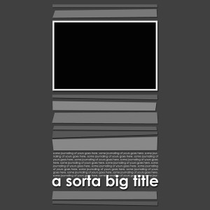
A reader recently asked me how I create my templates, because she is interested in making them too! So I’m using this Ask Simple Scrapper Saturday to give you some high-impact tips for making digital scrapbooking templates.
You might wonder if I’m giving away my trade secrets here. My answer is no, because templates (whether you sell them, give them away or not) are incredibly helpful for saving time and effort in scrapping.
Why make your own templates
Most digital scrapbook pages, with the exception of fantasy-style layouts, use two or more papers in different shapes. Templates allow you to draw those shapes ahead of time, allowing you to refine shape, size and placement without thinking about color or pattern.
Homemade templates for your own use don’t need to include a lot of placeholders for embellishments; they are great for arranging paper pieces and photos on your page. Think of these kind of templates as unpainted drywall. They’re the basis for great style.
How to make your own templates
When I make a template, all I’m really doing is drawing grayscale shapes on a page. Here are some tips:
Tip #1: Use the grid. Gridlines help you size and space the shapes you draw. To turn on the grid, go to View>Grid. To change the spacing and number of gridlines, open your Preferences>Guides, Grid & Slices.
Tip #2: Use the shape tool. Unlike the rectangular marquee, the shape tool allows drawing of a variety of shapes including rectangles with rounded corners. Don’t forget to check out the custom shape options, as you’ll find a large variety of odd shapes pre-installed.
Tip #3: Simplify before shadow. In the layer menu, you’ll see an option called “Simplify Layer”. This makes sure your shape can be treated like any other layer. You don’t want to add drop shadows before simplifying though, because the shadow will become part of the object and therefore be un-editable.
Tip #4: Take good notes. If you’ll be sharing your template with others, make sure to rename each layer in an informative or instructive way. This helps scrappers identify each layer and how to use it.
What questions do you have about creating templates?


And while it’s traditional to use shades of gray to make templates, it’s not a requirement. sometimes it’s hard to get enough contrast between adjacent elements to be comfortably visible. I’ve seen several designers start using an accent color, or a range of colors to allow for better viewing of the parts of the template!
Great tutorial – are the instructions for Photoshop or Elements?
I was using Elements. The only thing I can think of is that in CS, the name of the preferences area where you edit the grid sizing might be slightly different.
These tips though are generally applicable to most software applications.
I assumed you were using Elements, because in PS you can use the shape setting where you won’t have to simplify. It’s the right hand selection – Fill Pixels. It automatically simplifies, so you can skip that step. Really, the only reason you would NOT want your shape tool on that setting is if you think you will want to resize the shape, then leaving it as a vector would be a good idea.
Oh that’s great. Thanks for the tip!
oh, BTW, I meant to say – LOVE the template above!!
I love the template, too! Isn’t that the 1st template we used in the first WAL project?? It looks familiar and it’s awesome! I am going to go look! Thanks for the awesome tutorial, you simple scrapper guru! 🙂
Candi
I just checked and, nope, it’s not the same template! So I am here to say….hey, cool template!!!! I love it! While although SLIGHTLY similar, it’s not the same at all (as the first wal template you made!)
I hope it’s okay to post a link I found last week on another website. I came across these directions for making a template: http://www.scrappersguide.com/tips_el/creating-templatesel/
Great resource Erin. I used to make templates from my layouts – but now I go the other way. I find starting with grayscale helps me plan the design better.