Do you find editing photos intimidating? Diane Grenkow, who shares her story photo-by-photo at Mackville Road, is our guest today. She will introduce you to one of her favorite photo editing tools, Picnik.
 The beauty of Picnik, for me, is how easy it is to use. Â I have Photoshop Elements and I’m sure if I took the time I could figure out how to make good use of it. So far I have not, because Picnik is so simple. Â Also, Picnik is free.
Usually, I load my pictures to Flickr and from there I can edit directly with Picnik. Â You don’t have to use Flickr, though, you can go directly to Picnik.
Under the “Edit” section you have the option of choosing:
- Auto-Fix
- Rotate
- Crop
- Resize (good if your photos are large)
- Exposure
- Colors
- Sharpen
- Red-Eye
Under “Create” you can choose from Effects, Text, Stickers, Touch-Up, Frames, and Advanced. Â Right now, you can also use some Halloween tools to ghoul-ify your pictures if you are into that sort of thing. Â All of the examples that follow you can use for free.
Picnik-ed Examples
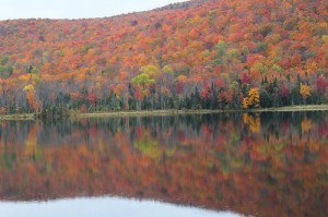
Here is the original photo as I took it of some amazing fall foliage last week. Â I’m not sure what I had my camera set on but whatever it was it didn’t do justice to the glory of the colors in front of me. Â No matter!
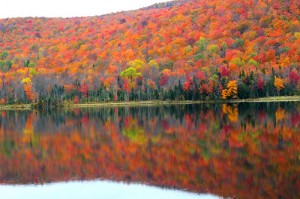
I went to Picnik and used the “Boost” tool. You can give it a lot for an over the top sort of color or you can give it just a little oomph. Â Almost all the tools have sliders so you can customize the edit to your liking.
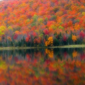
Another thing you can do, what I did here, is to crop the photo. Â You can just crop it to get what you want of the photo or you can use different parameters, this one is square. Â So first I made it square and then I boosted the color some and finally I used the “Soften” tool to make it dreamy. Â No, it didn’t look like this in real life but this is certainly the feeling that it evoked.
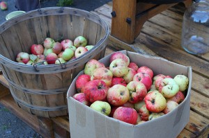
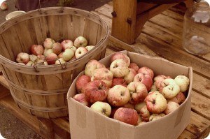
A few weeks ago we pressed cider . Â This was the original shot. Â I like it fine but it was a little on the cool side and I’m not crazy about the taped up cardboard box and that was what my eye was drawn to.
Here’s the same thing in sepia. Â Another fun thing you can do is make use of “Frames.” Â My favorite of the frames is “Rounded Corners.” Â Love the rounded corners. The rounded corners put me in mind of the old photos I have in my photo box from growing up. Â The Kodak moments of my childhood, rounded corners included.
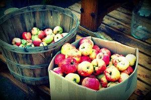
And here are the same apples under the influence of a boost, Cross Process, and a Vignette. Â I find that the cross process works best when paired with a boost — so I boost it first and then cross process it. Â The vignette feature gave it the darker edges. You can choose different shades to create the vignettes, too, though I usually stick with black.
Here is a picture of my little one. Â Below, I used the “Collage” option to put two photos together. Â The top picture is of yours truly, scanned in.
So I put the two photos together, gave them colored borders, and then added text. Â Under collage you can choose different numbers of photos to put together in different configurations — certainly you could find something you want to use with all the choices available and under text there are plenty of free font choices. Â You can choose the font, its size, and its color.
Picnik is also how I make my blog banners.  I may have used almost all the tricks in the Picnik basket (ha ha!  That was unintentional!).  First, I re-sized the photos. Then, I made a collage and gave them the nice orange-red stripe in between. I boosted the collage and cross-processed it. Then I added the orange shape by using the “Stickers” tool. You can make shapes of various sizes and colors or add other little things (like the guy driving the car there).  On top of the shape I added the text and voila!  New banner.
Thanks Diane! Have you tried Picnik yet?




I love Picnik! I won a year premium membership and love all the options in the premium version. It’s so easy to use. Forget Photoshop, I’m a Picniker!
Thanks for the great article! I just re-blogged.