I have a confession to make. I am infatuated with Project 365 layouts. Week after week, I love browsing the galleries for these special pages. However, as you know, Project 365 doesn’t fit into my busy lifestyle. So why the fascination?
First of all, I love the simple focus on words and stories with a few products that support not detract. More importantly, I find these layouts to be unique studies in multi-photo design. We all want to get more bang for our scrapping effort and Project 365-style pages are a prime mechanism. I enjoy seeing how the scrapper found bits of space for journaling and made a full page totally work.
Below are some of the best examples I could find and what I’m loving about it. I encourage you to click on each layout to visit the artist’s gallery and leave a friendly comment.
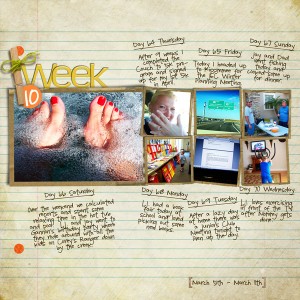
But first, before you do that, I need to offer some special recognition to Kayleigh. She is a wonderfully talented P365 scrapper, one of my scrapping icons and the artist of the layout above (and yesterday’s too!). If you’ve never browsed her gallery, be prepared for your jaw to drop.
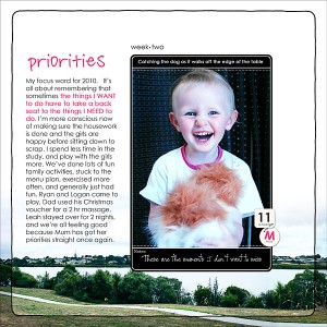
Loving the use of an image as the background
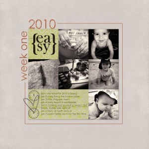
Loving the emotive quality of black and white
Loving the look of a tabbed file folder

Loving the tacked-on word strips
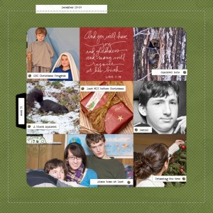
Loving the little day-of-the-week bits

Loving the tightly controlled design
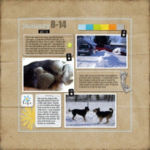
Loving how the journaling fills the background space

Loving how this imperfect layout feels so perfect

Loving the little details, like the pull quote

Loving the highlighter effect on the black
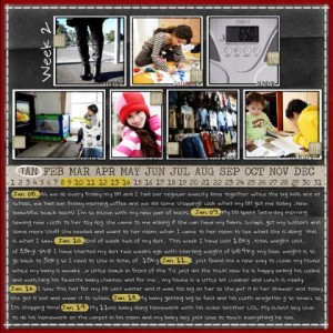
Loving the ultra-simple design

On some inspiration posts, I comment a lot- and on others a little. I this case, I didn’t want to detract from the images with too many words. I want you to study the examples and pull in your own insights. So tell me, what design tips did you gather from this mini-gallery?
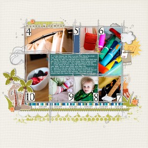

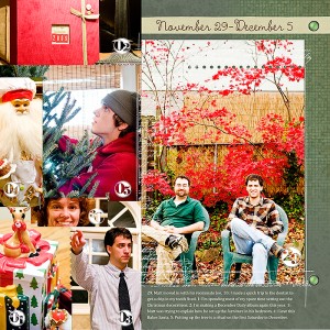

Honestly, I love them all! LOL This is my first attempt at P365 and the inspiration I find in galleries and ideas shared in forums is invaluable. The 2 biggest things from your selection of samples that popped out at me, you happened to point out as well. The pulled out quote, like a magazine article – GREAT scrapping idea. Also the LO where the layer of paper that the photos were on was also journaled on in between the photos. A very cool look.
I have no idea how difficult this is going to get as time goes on, but I’m determined to stick with it! 🙂
Thanks for your blog ! I adore it
what a fabulous site!! and woo hoo for my friend Kayleigh . . . she is so talented and continues to blow me away with everything layout she creates….
have you seen her quick pages over at Designer Digitals? they are listed under Katie Pertiet’s name (Kayleigh uses her supplies), but WOW oh WOW!
What a beautiful selection of layouts!
They are gorgeous!
Kayleigh is my scrap crush 😉 I check her gallery when I am in need of inspiration and always leave wanting to create! I have even started a P365 album just like her layout above!! Thanks for all the great links, love all these layouts!
I wanted to let you know that I appreciate it when you gather the latest, coolest, most interesting, and just plain pretty layouts and designers from around the web. I’ve loaded up my Google Reader with your spotlights. Thanks!
this selection is uperb, i like it, thanks !
your newsletter is so great, a real pleasure to receive it and discover all your tips ! thanks.
Thanks for these great ideas on how to do my lo’s for project 365! starting 1/1/2011! cant wait!