Is it just me or are popular styles and trends in digital scrapbooking evolving? I’m seeing fewer layouts with super-tiny photos and lots of white space and more pages full of journaling, color and artistic touches.
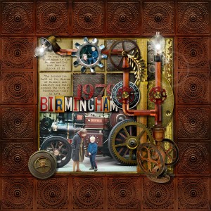
1. 1979 by pSyren: Can you believe this started with a super minimalist graphical template?
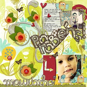
2. mimo pro Mauro Neto!! by valeriapiemonte: This is just an explosion of creativity and style!
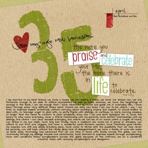
3. 35 reasons by hguenthe: Fabulous title work with mixing of word art and fonts
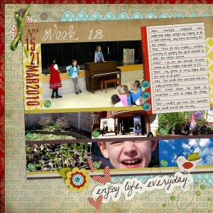
4. Week 12 by QuiltyMom: A brilliant showcase of the product and very appealing design
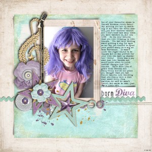
5. Born Diva by Fee Jardine: I love how the colors in the photo and kit mesh so well!
What trends are you spotting more or less of in the galleries?
- Are super minimalist (i.e. tiny) layouts a thing of the past?
- Are we seeing more influence from the paper scrapping world?
- Will digital art journaling (with or without photos) continue to grow in popularity?
What’s the “style of the day”? Tell me, what’s hot and what’s not? What do you think will be next?
“Fab Five” is a series of occasional posts that highlights trends, themes or styles in scrapbooking with five outstanding pages.
I’m not sure if it’s the next trend but I LOVE the style of Simply Yin – she packs her pages chock full of photos in order to tell her story in the most beautiful way. I’ve always done this and was so glad to find others were doing it too. I pick the pictures I need to show in order to tell my story and then fill in around them, scanning items and keepsakes that are important to my story. I don’t have a gallery per se but I do upload my pages to my shutterfly account for book printing if you want to take a peek. http://inkandpixels.shutterfly.com/26
Hi nrussell,
I took a look at your layouts in shutterfly and just love them. I, too, like to put a lot of photos on a page. What you do that I love is the little journaling snippets that make the story complete. For example, your layout of the swinging through the rain forest was just great.
Lady Bug,
Thanks so much for taking the time to look at my pages – so glad you like them! I’ve never really posted them anywhere since it’s sort of a different style than we usually see in the galleries. But for me it’s about getting the story and memories down. I’m always thinking about the photo I need to get to complete it and the journaling I can add to remind myself of the funny things that happened. We forget all too quickly! I almost always complete a 2 page cooridinating spread as well. It gives me more space and each time you flip the page you get to see a new adventure. When I have enough pages (and there is a sale!) I’ll print a book.
Thanks again for taking a look,
nicole
Oh I hope those trends are going bye-bye (the small photos and massive white space). I’ve never understood that style and I personally hate it! I love to fill every space of my page – with photos, elements, journaling — as much as I can fit. I try to scrap to tell a story, and when you do that – a little photo with a couple elements in the corner of nothing doesn’t really do that – not when you want to capture the whole event of Easter, or Christmas, or a birthday or something…
OMG!! Thank you so much!! It is such an honour to be featured here!! You made my day 😀
I for one hope the teeny tiny photo type of LO is going away. The fantasy type could also disappear and it wouldn’t bother me. These types of pages are art, not scrapbook pages. Scrap booking is supposed to be about preserving the memories and stories of your family.
Congrats Bec – your layout is fantastic!!!
Valéria amei o seu tb !!!!
Fee Jardine : love the colors !!!!
I was blown away when I first saw Bec’s layout. So simple yet such impact. Just a gorgeous page, photo, colors, etc.