Fab Five is a once-in-a-while feature where we share 5 beautiful and authentic layouts from the galleries with you!
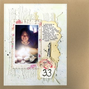
1. 33 by milkcan
Loving all the crocheted lace in the background, but think its super cool to see an 8.5×11 layout matted asymmetrically on a 12×12 piece of cardstock. This is one great way for both digital and paper scrappers to transition a letter-sized page to 12×12!
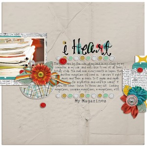
2. I Heart by Shades of Bliss
Non-people photos can sometimes seem awkward as the focus of a layout. I love how this artist made her title and journaling the focus, supplementing with the photos. As an added touch, the chosen supplies complement the photo nicely – pulling out details of lime green and orange.
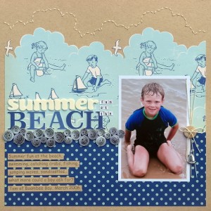
3. Summer fun at the Beach by Melinda Spinks
This page shows how you can enjoy playing with and celebrate product while keeping your photo and story as the focus. It has a lot of details but is still very clean and airy feeling.
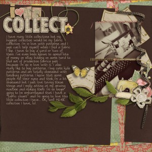
4. I Love to Collect by heathergw
The layered papers totally jump off the page for me. I love subtle but outspoken touches like that. The artist made a great decision in making her photos sepia toned to not clash with the product choices. As with I Heart, the journaling is the true focus here.
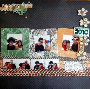
5. Coastal 2010 by jonaks
This page caught my eye for 1) using 7 photos in a small space and 2) incorporating memorabilia into the design. I’m also loving the dimensionality of the butterfly and all the contrasts in texture.
Thanks for the pic! Love the other layouts too!
Thank you so much! You totally made my birthday a bit brighter!