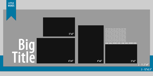
Quick, say that title 5 times fast! Templates or sketches are one of my favorite ways to get started telling a story. I find that anything that gets rid of a decision that I have to make while scrapping helps me accomplish more.
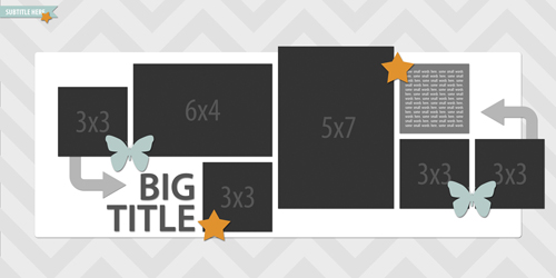
With a template, the design is started for you so you can focus on photos, product selections, and most importantly the story. That is until you realize that templates are not really set in stone. You can easily use them as a jumping off point for creating a very different looking page than the original design!
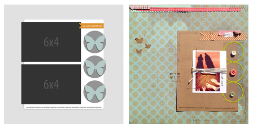
I asked the Simple Scrapper Creative Team to help me out and they put together loads of creative ways to change up templates.
1. Shrink It
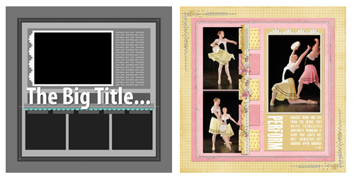
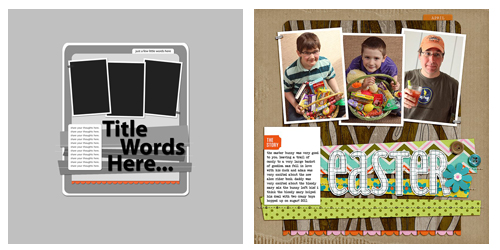
Aimee Maddern used a template from January 2012 and shrunk the main area down. Once it was smaller, she moved it to the right quite a bit. This is a great technique if you are a scrapper that likes smaller photos and/or more white space on your pages. (To shrink the main area in Photoshop, simply select the layers (leave the background) in the layer palette and click on Edit – Transform. While holding down the shift key, drag the corners to the size you like.)
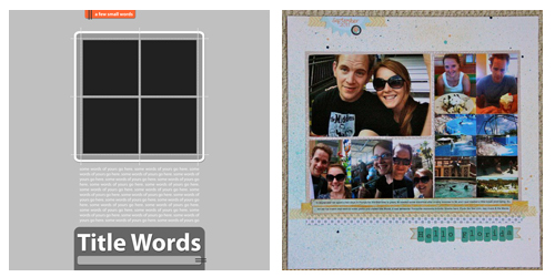
Supplies2. Add More Photos
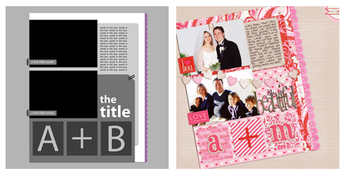
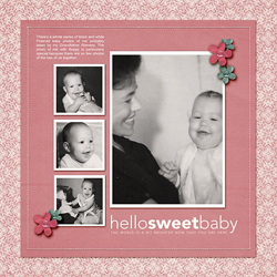
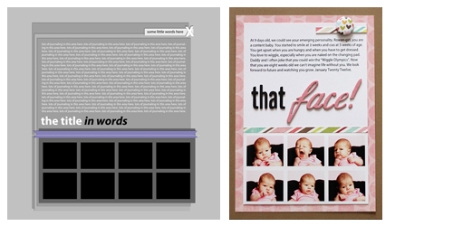
Krista Wells added more photos to this template from April 2011. Krista used the spaces that were already marked as photos and broke them up into collages. You could also use a piece designated for patterned paper or journaling and fill it with a photo. Or use the space that two photos take up and use three!
Supplies3. Get Rid of Some Photos
Amy Kingsford reduced the number of photos on this template from January 2012 by adding elements in place of the photos. You could also just merge two spaces into one space OR delete the photos all together!
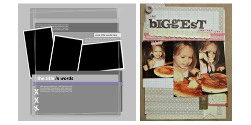
Supplies4. Turn It On Its Head
Brianna Marshall chose a template from July 2011 and the entire layout 180 degrees, basically upside down! (In Photoshop, select Image > > Image Rotation > 180 degrees.)
Supplies5. Spin It One Way
Ronnie Crowley rotated this template from February 2011 90 degrees clockwise. Remember you can do this either way. After you rotate, you might want to rotate the title or journaling back and place it in a different spot on the page. (In Photoshop, select Image > Image Rotation 90 degrees. Then use Edit>Transform to rotate the text layers back.)
Supplies6. Tilt It
Mandy Ross tilted the main area on this template from March 2011. Tilting elements is an art, you really down want to go too far one way or the other! (In Photoshop, select the layers you wish to tilt, then Edit > Free Transform. Hover with your mouse at one of the corners, you’ll see a curved arrow. Then move your mouse, to turn the layers.)
Supplies7. Make a Card
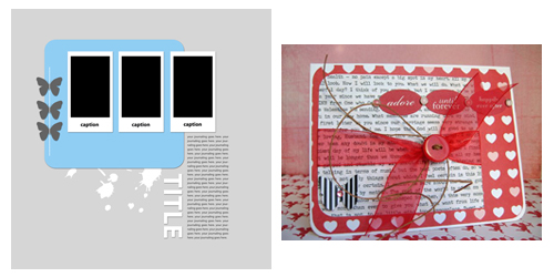
Michele Holcomb created a card from a May 2011 layout sketch. What a creative way to use a sketch!
Supplies8. Double It
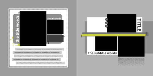
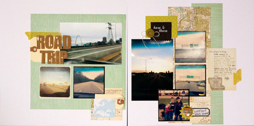
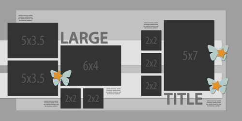
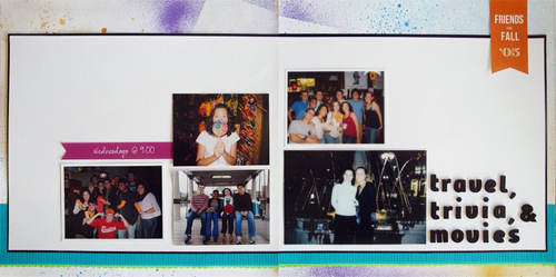
Jennie McGarvey created a double page layout from two January 2011 single page sketches. You could also take one single sketch and stretch it out across two pages. Or even take a single page sketch and flip it to use as a second page!
Supplies9. Cut It in Half
Jean Manis created a single page layout from a January 2012 double page spread. This is an amazing way to get more out of your templates. Each double template is two single pages! (To crop the page in Photoshop, simple select the Crop tool from the tool palette then change the sizing on the top toolbar to 12 inches by 12 inches and 300 dpi. Drag your mouse over the left or right side of the page until the whole side is selected, then hit enter.)
Supplies10. Make it Another Size
Jess Forster changed the size of this July 2011 12×12 template to 8.5×11. (To change the size in Photoshop, first resize the template using Image > Image Size to 11 inches x 11 inches. Then create a New Canvas (File > New) sized. 8.5 inches by 11 inches with 300 dpi. Then go back to the template, select all of the layers except the background, and drag them onto the new canvas. At this point, you may resize the layers using Edit > Free Transform.)
Supplies11. Flip It
Julie Kelly flipped this December 2011 double page sketch horizontally. It’s a mirror image of the original! (In Photoshop, select Image > Image Rotation > Flip Canvas Horizontally. You will need to flip back your text and title layers using Edit > Transform.)
12. Create Something Entirely Different
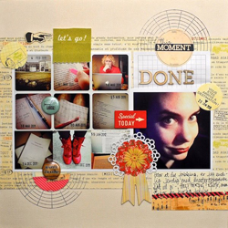
Margrethe Johnsen created a page that was inspired by this sketch from January 2012. It still has the feel of the original, but it still very different!
Supplies13. Stretch it Out
I stretched the main area to the edges of this April 2011 template out to the edges of the page. This is a great tactic for scrappers who love large photos! (In Photoshop, select the layers you wish to stretch in the layers palette. Then select Edit > Free Transform. While holding down the shift key, drag the corners until the size is where you want it.)
SuppliesSo next time, you get started with a template, give one of these ideas a shot. Not only can this help you fit your photos to the template, but you’ll be getting a lot more bang for your buck using the template a variety of ways for different looks!
The versatile sketch templates featured in this post are just a small selection of those available with the Premium Membership. Each month, five new page designs are added to the library of exclusive members-only downloads.

LOVE this post!!! I think I knew most of these, but have forgotten many of them. And how wonderful to have all these “recipes” for template manipulation/customization in one place! Thank you for sharing. Happy Valentine’s Day!
Great tips – I think templates are a great place to start, especially when I might be a bit lost or down on inspiration. But your list shows that from there, I can work in my own style and make it my own 🙂
TY. For months now, I’ve been searching for “a round tuit” so that I can encourage myself to learn how to use templates. This is IT, in a nutshell. So clear, such variety. Thank you for inspiration enough to challenge this slump into creative lethargy. TY.