Recently I came across a patterned paper from the Studio Calico October 2011 Field Guide kit that I didn’t have any idea on how to use when I received my kit. The sun-ray paper, an exclusive paper made by Sassafras for Studio Calico, screamed for a summer, outdoor layout, but with the gray fall weather in the Pacific Northwest at the time, I just wasn’t thinking about sunny outings.
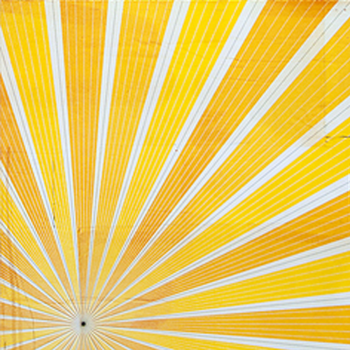
Sassafras for Studio Calico paper
from the Studio Calico Field Guide Kit
Starting Point
I hardly ever start a scrapbook layout with a paper choice. I’m more likely to see a set of photos and then look for an appropriate template to use, or for my creative team assignments, I start with the template and find photos. Since I was starting with the paper this time, I could have chosen either path–starting with photos or a template–and decided that it made most sense to find photos.
Finding Photos
Digging through my photos, I found two from a summer outing at which my sons had eaten ice cream cones. I would have preferred working with three photos, but these photos were from pre-digital days when I took far fewer photos. I’ve learned to work with what I’ve got!
Choosing a Template
I browsed through the Simple Scrapper Premium Membership Library of sketch templates, evaluating those designed for two photos. I ultimately chose a single-page one from the February 2012 collection.
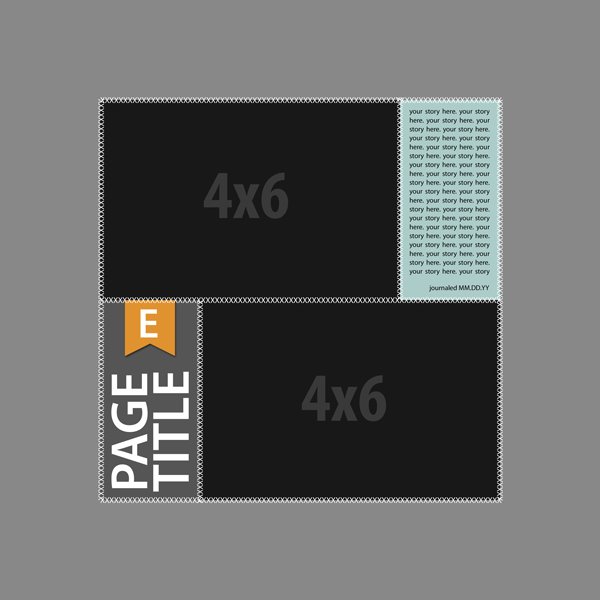
Simple Scrapper February 2012 Sketch #3
Starting the Layout–Digitally
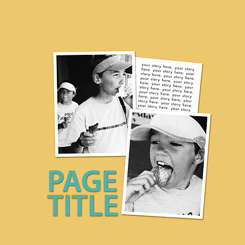
I scanned my photos, made necessary color corrections, and brought them into the template in Photoshop. I made the background a shade of yellow to simulate the patterned paper and removed the stitching.
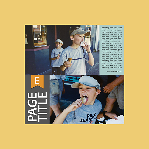
Wanting to see what the layout would look like with portrait, rather than landscape, photos, I rotated the template 90 degrees clockwise. My original photos had a lot of elements on the sides that distracted from the focus. I turned off the monogram element and the journaling, since I was still at the brainstorming stage.

I definitely preferred the portrait photos, but decided that I wanted my title in the lower-left corner, so I vertically rearranged the photos, title, and journaling spot.
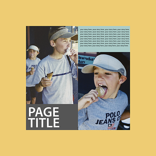
Having settled on the portrait orientation for the photos, I began to think about the page’s overall color scheme. I realized that the colors in the photos didn’t really go with the yellows and oranges in my patterned paper. I converted the photos to black and white in Photoshop. At the same time I added white borders, and shortened them to be 4” x 5” rather than 4” x 6”. I settled on a split-complimentary color scheme, so I changed the title color to be teal.
I decided that I would put the sun center in the upper-right hand corner of the layout and changed the journaling card to be more vertical than horizontal. Finally, I layered the close-up photo of my youngest son on top of the photo of my oldest son at an angle for a more informal feel to the page.
Finishing the Layout–Traditionally
It was finally time to print out the photos and begin to work with the paper and other embellishments. Before I could lay down my title, I had to choose one, which is a task that I struggle with. I turned to Peppermint Creative’s Title + Phrase Guide. Choosing the Summer category I found A Little Taste of Summer, which seemed perfect for the photos. I didn’t have any teal dimensional alpha stickers, and I was determined to complete the layout without purchasing additional supplies. I decided to dye Vanilla Doll Thickers by American Crafts with Tim Holtz Distress Stain in Broken China. I applied the stain several times to get the desired color.
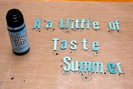
I adhered my title to the lower left-hand corner before adhering anything else. Once those were down, I added the photos and the journaling card, which I created in Photoshop to achieve the reverse-type look. At this point, I shopped my stash for embellishments to finish the page. I covered the point where the sun rays came together with a pinked-edge paper that had been included in the Studio Calico Glee Club kit.

Where are you most likely to start a layout? With a sketch or template, with a set of products in mind, with photos, …?
Love it! Learned quite a bit. Have done traditional & digital scrapping, but never put them together. You’ve inspired me!
This is a great layout. I use a lot of the templates from Simple Scrapper Premium and basically use them as a starting point for my traditional paper layouts as I don’t scrap digitally.