Team member Ronnie Crowley will be sharing ideas and inspiration from our team for the reader challenge each month.
This month’s Simple Scrapper challenge:
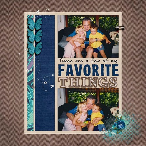
Use multiple fonts/alphas in your title on a layout.
Team Inspiration
Mandy Ross uses the challenge to record a slice of everyday. Her title is a mix of fonts and alphas which creates interest and texture to here title. (credits)
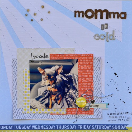
Aimee Maddern focus was her cute doggie. Using a mix of alphas for her title she added even more interest by stitching them onto the layout. I really like how her title totally expresses what she thinks her doggie was thinking. (credits)
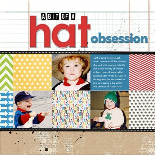
Jean Watson Manis shares a layout about her son’s hat obsession using a mix of alphas. I can totally relate to this as I was that child myself and love her use of color in the title as well pulling the colors out of the pictures. (credits)
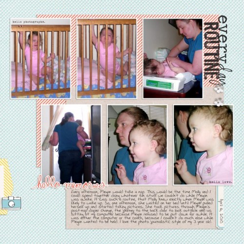
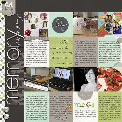
For my layout I took the chance to scrapbook some older pictures which I’ve recently scanned. I used a mix of a font and alpha’s creating dimension with the alpha. (credits)
Lisa Corbin-Polak creates real interest in her title with the mix of fonts and alphas she chose. I especially like the contrast between the metal alpha and the painted alpha. (credits)
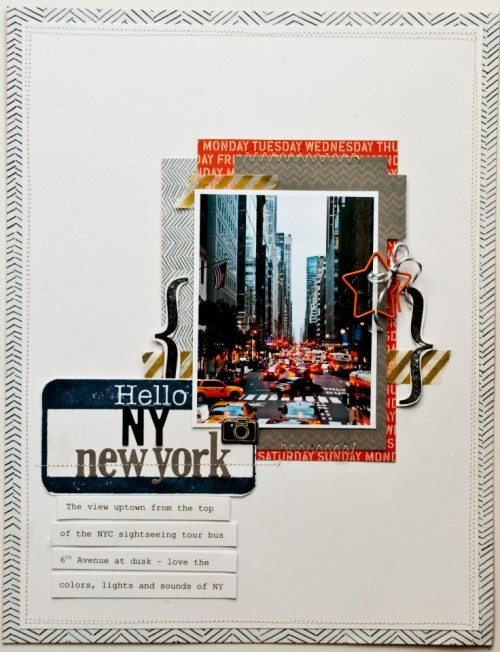
Valerie Mangan created another great travel layout with her New York. What a great use she has made of her “Hello” sticker to incorporate it into her title. (credits)
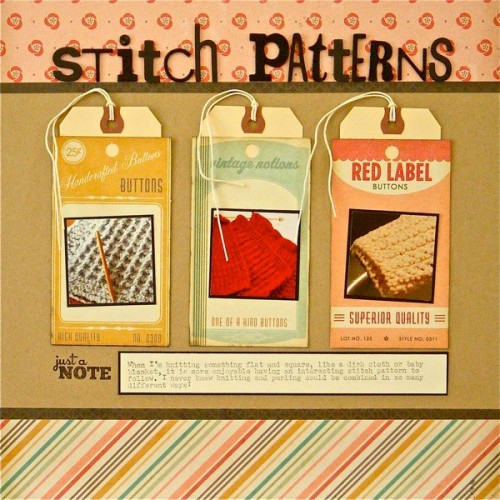
Sue Althouse Stitch patterns title is all one color she has though chosen a wide range of different fonts.This is a great way of using up those old letters on your alphabet sticker sheets. (credits)
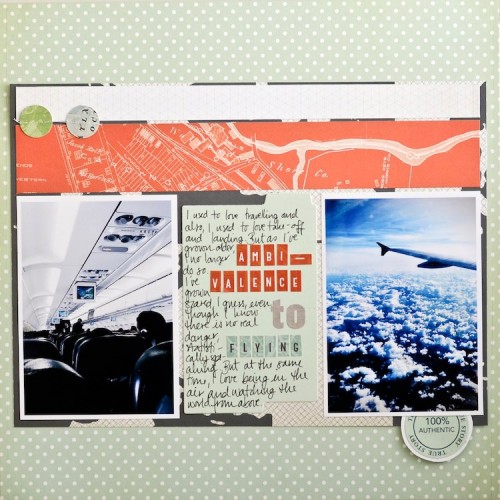
Margrethe Aas Johnsen ponders on change in feelings towards flying. She has chose alphas which match the colors of her papers which provides repetition to her layout and helps provides balance even though she has mixed it up with the size and font. (credits)
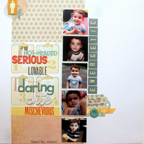
Pam Lozano took the challenge “totally seriously” and I think she wins the prize for using the most and it totally works. (credits)
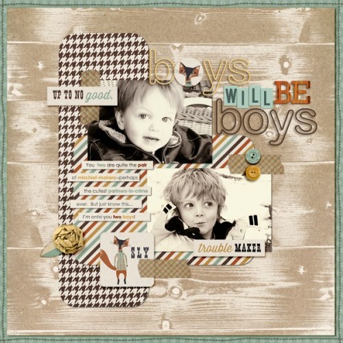
Amy Kingsford Boys will be Boys layout cleverly mixes not only alphas but she replaces one letter with a flair. (credits)
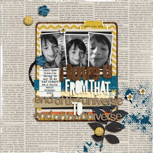
Jeryn has created some great texture with her choices of alphas in the title – what fun! (credits)

Now it’s your turn! Win $15 print credit from Persnickety Prints by taking on this month’s Simple Scrapper challenge by November 25, 2012. Visit our challenge area for instructions on how to enter!
0 Comments