I‘ve made a few process videos for special projects recently and thought it was time to do one for the blog. If you would like to see more of these, please leave a comment.
In this first video, I’ve focused the annotation on my storytelling approach rather than specific design techniques. I would also love to know if this was helpful and whether you’d prefer additional voice-over discussion.
Process Video #1 | Double-Page Heritage Scrapbook Layout
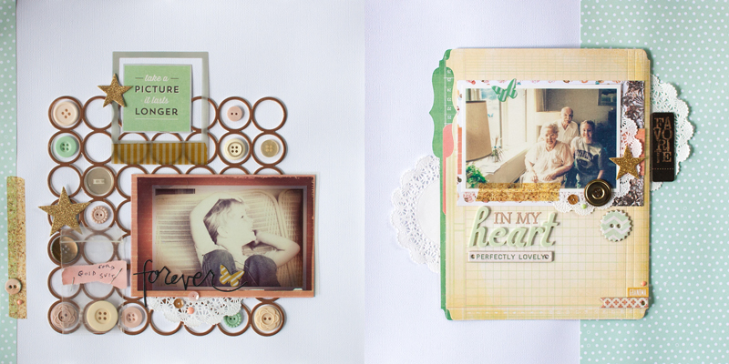
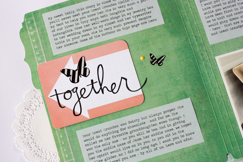
In my This is What You’re Saving For video, I mentioned that I was working on a not-so-simple layout. I had discovered that practicing simplicity regularly allows me to explore and spend more time with a story when I want to. Though this is a fairly product-heavy page, many of the design choices were symbolic (buttons, butterflies, favorite die-cut) and deliberate.
Note: If you photograph your pages outside in 98% humidity, they will warp.
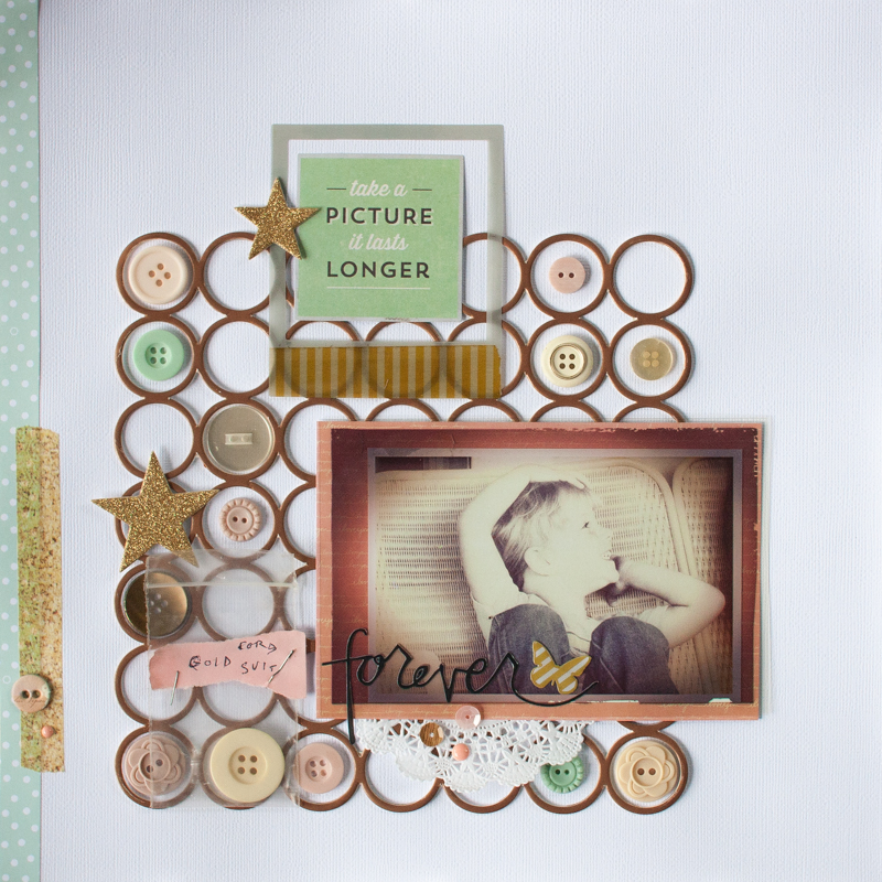
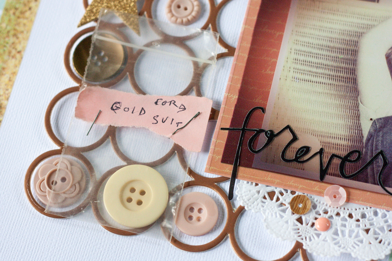
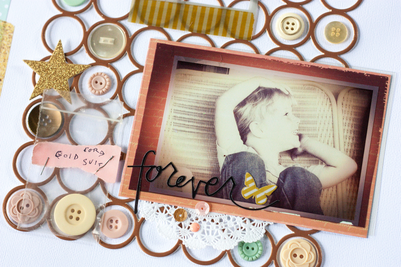
The story + design inspiration for this page came from the gold circle placemat from Pink Paislee. I was looking through my stash for items to fill up those circles, when I was reminded of a bin of buttons that were my grandmother’s.
In Art + Science, Stacy showed me how many of her layout ideas come from story + design triggers like this. I went with it and very much became immersed in the process of uncovering the story I most wanted to tell.
I even found one button still in a little baggie with her handwriting on it. I knew this had to become part of the page.
I have very few photos in my possession of my grandma (my parents have more), but I did have one of me with her that my mom had displayed for many years. Though it was quite faded and you would have to know that I was looking at her, it very much set the stage of me as the storyteller.
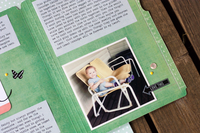
The yellow glider that I was sitting in also served as a visible thread through time. With this photo of my daughter sitting in the same glider, now on my porch 30 years later, I knew this page would be a story to my daughter about her great grandma.
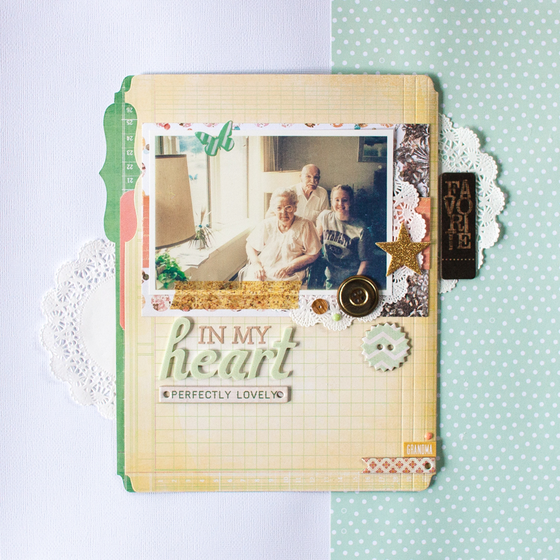
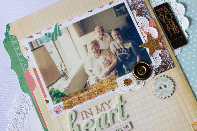
As I began a single page layout, I quickly realized that my longer story would need a separate home on a second page. A mini memory file from Heidi Swapp served as the perfect home for this personal story and an additional photo of my grandparents with me, the last one with all three of us together.
This 6-minute video takes you through the start-to-finish process of creating this page. Don’t forget to leave a comment letting me know what you think!
Sketches and templates for this layout (to be used together or separate) will be included in our September storytelling kit, available exclusively to premium members.
Jennifer,
I really enjoyed watching this. It gave me insight as to how you choose and then move things about. I have been attempting to be less of a perfectionist lately and to have more fun.
Beautiful – and a great story! TFS. I would like to have heard your voice, but understand when you speed it up it doesn’t work!
Simple, elegant and to the point. I also like how you use the Heidi Swapp folders–I have actually been cutting theme in half and using for journal pages but now I can see a use on a scrapbook page!
Beautiful page about a beautiful story. I loved watching you put it together.
This is wonderful Jennifer! I’m in possession of many old photos and always on the lookout for scrap layouts to show them off; this 2-page spread is perfect for telling those lovely stories. TFS! And would love to see more like this from you on the blog!