Oh, that is so cool. Pinned.
I would LOVE to try that. Pinned.
Maybe I could scrapbook like that. Pinned.
There are so many ways today, like Pinterest, to easily collect inspiration for your scrapbooking. But it’s harder to make use of these great ideas, especially when there are so many.
In this week’s pep talk, I want to share a story of how I used inspiration recently along with tips on creating scrapbooks that reflect your unique style.

This year in my 2014 Project Life + Library of Memories album, I’m doing something a little different. I’ll be creating monthly Project Life-style spreads. (Much more on this soon!)
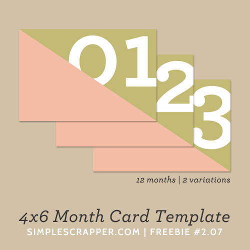
As part of this change, I wanted to have one 4×6 card for each spread that designated the month. I also wanted it to have a consistent style from month to month.
I briefly considered these (awesome) 4×6 calendar cards from Elise Blaha Cripe, but it didn’t make sense for my album about life in central Illinois to have palm trees in it. I also looked at adapting Liz’s 3×4 calendar cards into a 4×6 card.
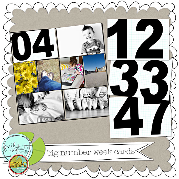
Neither of those felt right and I didn’t really care that much about having a whole calendar on the card. But I had an aha moment when I saw these 4×6 big number week cards in Emily Merritt’s Project Life album. So cool!
I almost took the leap (they’re so affordable), but decided these cards weren’t quite what I was looking for. Perhaps just a little too bold for me. I browsed some more.
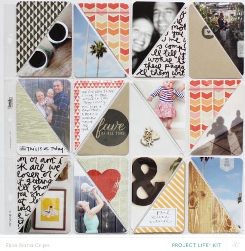
Not finding the right thing in stores, I opened up Photoshop at started playing. I had seen use diagonal triangles on her Project Life cover page, totally starting a new trend. I will never be one to start trends, but I’m happy to play along.
As I started playing with a 4×6 card design, I also remembered how Cathy Zielske is using week numbers on her photos. (Note: If you’ve ever had an interest in doing digital Project Life, watch Cathy’s video!)
In the end I came up with a flexible 4×6 template that can be used five ways:
Option 1: white text over photo + patterned paper
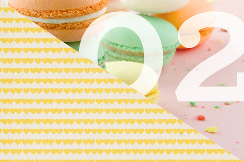
Option 2: white text over patterned paper + photo

Option 3: black text over patterned paper + photo

Option 4: black text + photo

Option 5: black text + patterned paper

Credit: example patterned paper from You are My Fave by Paislee Press
I’m not 100% sure which option I will choose for my 2014 album, but I will definitely share soon. Which one is your favorite?
What’s the moral of the story?
Each time you have a design need in scrapbooking, it is an opportunity to reach into that well of inspiration. I created a solution out of desire and necessity, incorporating ideas from many other scrapbookers into my own unique piece (a Frankenstein’s monster, if you will).
They say that all the ideas have already been had, but I disagree. Every time you create, you get a chance to build upon all the awesomeness that has come before you and make something entirely new from it.
Even if you draw inspiration from other scrapbookers, no one can take away the critical element that you bring to a design: YOU.
So here’s what I’d like to leave you with. Browse, and swoon, and by all means pin all the things that fill you up with excitement about scrapbooking. But the next time you sit down and have a gap to fill in your scrapbook, lean on that inspiration as a starting point for your own unique creation.
The Weekly Pep Talk shares one strategy to help you simplify scrapbooking and focus on what matters most.
Thanks for the card, jennifer! I’m gonna steal it (as Austin Kleon suggests!). I have been feeling left out of the game and resisting project life because I just know the weekly commitment can’t be met, and it don’t want to add yet another UFO to my projects list. But I did committ to a monthly roundup,using the pages and supplies; monthly, I think, I can manage.
Shine on!
Kelley
Great! And remember, it can be as simple as you need it to be. You could have one card that has a monthly roundup on it and then fill the pockets with photos. These page protectors would be perfect for that:
http://store.scrapbook.com/wr-50072-8.html
Still settling into my PL this year. A spread a week is definitely too much for me, but one a month isn’t enough, either, most months. I’m going for the varied approach this year. I’m doing three speads for January: one 2 week spread, and 2 one week spreads, and we’ll just see how each month ends up.
Oh, but I wanted to say the cards are awesome, and I think I can use some of them in my album. I am thinking of using them at the end and beginning of the school year to designate my kids’ grade in school this year and next. Just another idea for 12 cards!
Great idea, thanks for sharing! I love how you’re “breaking the rules” with your project and making it work for you.
I haven’t gone so far as to design my own elements, like the card you developed, Jennifer, but I have created my own photo-masks. And I have taken PSD templates and moved the elements around to make the spread better fit my needs (see the “Deck 6 Boardwalk and Beyond” Layout in my Oasis of the Seas album in the Start Fresh Facebook group.) I don’t know that I’ll ever do a PL album as I can’t imagine taking a picture a day. I don’t have children around any more (they both moved to California) and there are only so many pictures you can take of the same four animals and one camera resistant husband. And I’m not really into “selfies”. But then again, maybe one year I will (or I might do a monthly round-up which seems doable.)
You are always very creative Francine!
I’m definitely not taking a photo a day. I tried that in 2009 and quickly realized it wasn’t for me. I’m excited to try doing monthly roundups and will be reporting regularly on the blog.
I don’t know if you remember this, but in 2009/2010ish, monthly roundup digital layouts were really popular. I think there’s a lot we can learn from the past as so many try to simplify “Project Life”.
I am not Project Lifer, so may not have use for these templates (for the moment), but agree with your encouragement to realize you can have the ability to create something new and unique to accomplish what you need in a layout. I have printed background papers with a personalized map to use in a holiday layout
Thanks Deborah, and it’s not even about literally making something new with Photoshop, but combining ideas and supplies with your photos to create something unique!
So that’s what you were doing with those cards. FUN!
Thanks, it was fun. I was totally set against making anything myself, but decided to combine the best of what I’d see to create something new!
This is very cool! Thank you!
Personally, I like #4, but hey, the fact that you created them, means you can vary them and print to your liking!
I am not into PL…and I’m just barely into scrapbooking. I’m a card maker and love to play with paper using my Cameo. I want to start scrapbooking though–just LIFE gets in the way!
I love the ideas with the 4×6 cards with the numbers. I’m already thinking of how easily they can be used in my traditional scrapbooking layouts for calendar dates, birthdays, school grades or just about anything that uses numbers!
Thanks for the inspiration!