Four out of my last five layouts were 8.5×11. I love how easy it is to achieve a balanced composition with the portrait shape.
I also find that this size suits my natural inclination to scrapbook with just one photo. I don’t go into a layout planning for it to be 8.5×11, but I grab that size of card stock more often than I grab 12×12.
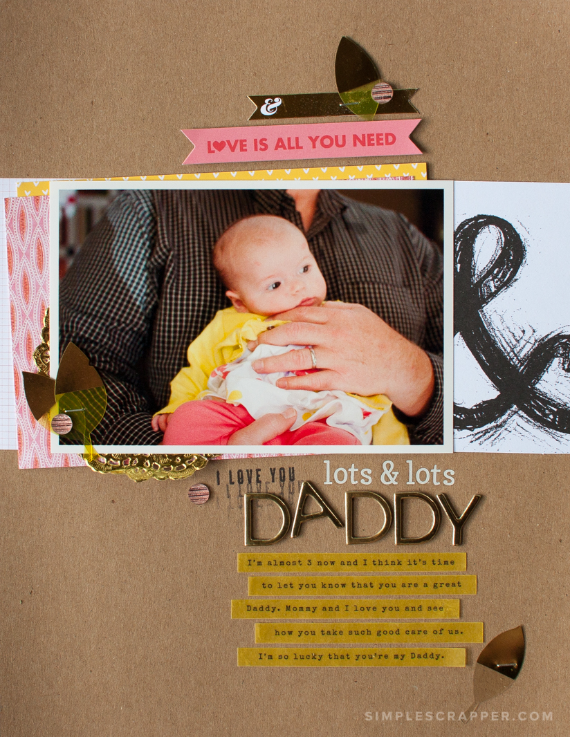
This simple 8.5×11 scrapbook layout is one of my recent favorites.
I’ve had this photo of Emily and my husband Steve printed for a long time. There’s something about seeing those big hands (and that wedding ring!) on a tiny baby that makes a mama’s heart swoon.
I used a simple cross design, but added a twist with the angles. By rotating my layering papers slightly, I created an angle on which to build some embellishment. The doily softens the harshness of the angles.
This title was fun to create. I’ve been really enjoying combining stickers and stamps to set the context and add visual interest to a scrapbook page. I’m also addicted to writing and printing on vellum.
I wrote the story from Emily’s perspective in the present day. Though I used her voice, I used a timeless storytelling technique in bringing together an older photo with a feeling from today.
“I’m almost 3 now and I think it’s time to let you know that you are a great Daddy. Mommy an I love you and see how you take such good care of us. I’m so lucky that you’re my Daddy.”
Most of the products used on this layout were from the Camelot Project Life kit and paper pad by Studio Calico.


Using an older photo and writing from your daughter’s perspective is a really great idea! I love how the photo and title work tells the basic story; the journaling really completes it.
I never think to scrap in this size as I am a 12×12 girl, but you have me thinking about trying it.
Great layout, Jennifer!
You must try it at least once… you’ll be hooked!
Love, love, love that you scrapped 8.5×11!!!! This size seems to help focus on story instead of events. Love seeing your layouts! Would love to see more!
Thank you Sharon! I am trying to get back into the habit of sharing them.
Yes, I think that is exactly why I love 8.5×11 so much… it helps me focus on getting the story told and not on sharing every photo or using every product.
Love how simple this seems! Looks like I can use several of those PL cards I have ! Yahoo! Definitely need to make an 8.5×11 LO!
I love using PL cards on my layouts, especially this size!
Beautiful! Love all your wee elements….elegant….a heartfelt expression…an adorable photo
Thank you!
I love it…. this is fantastic to make the little girl express herself…
Thanks for sharing…
She is more expressive than I could ever capture in words!