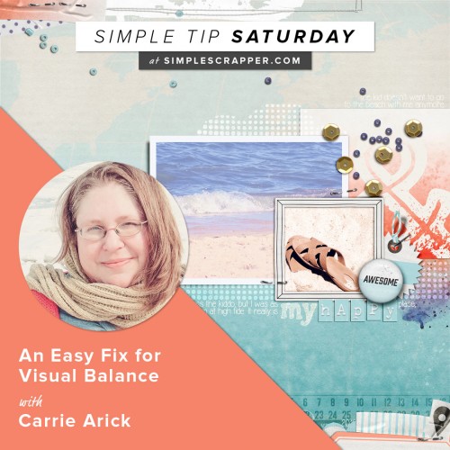
As part of our Simple Tip Saturday series, we’re inviting fresh voices into the mix. Today we’re hearing from Carrie Arick with her simple tip.
What is one way you simplify scrapbooking?
I always frame my layout in some way. It’s my go-to for finishing a page. It’s visually interesting, but incredibly fast and simple to do.
What problem does it solve for you?
It’s all those choices when designing a page that slows my process. I can easily get overwhelmed and unsure of what I’m putting on the page and how it’s all going to go together. Where will the eye start, where will it finish and how do I make that flow happen? What will make the parts of the page look like they all belong together? How am I going to make the page feel balanced polished? Framing my canvas is my trick for solving these problems and helps me make confident choices for the rest of the page.
Why do you think it works so well?
By framing my canvas, I know I’m creating cohesion between the page parts. Not to mention, knowing what the finish line is allows me to scrap faster and more confidently. If the flow isn’t quite right or the page feels off balance, you can simply adjust your framing to compensate. Framing at the top and the left sides create a place for the eye to start. Framing the right and the bottom tell the eye it’s at the finish line, so it’s time to go back to the starting point, keeping the eye on the page. Plus, you can frame every single page you make and it never feels tired.
How can others get started with it?
There are a variety of ways this framing can be accomplished. To make it cohesive, I recommend that you stick with the colors, patterns and style of the rest of your page:
- Add paper strips, washi tape or paint at the top and bottom of your page to create a frame. Many digital designers offer pre-made frames or borders for your layout, making this even easier. For paper scrappers, you can use leftover bits of paper.
- Instead of framing the top and bottom, try framing the left and right sides.
- Create a small cluster on one on side of your frame to add extra interest.
- Add stitching, staples or brads for extra polish
- Add a neutral color border around your entire layout. It can be that simple!
Simple Tip Saturdays are for sharing easy ideas to grab and go. Would you like to be featured? Complete this form to submit a tip for consideration.


0 Comments