I love the concept of the Week in the Life project, but I have taken a more minimalist approach since I started participating in 2010.
Week in the Life is a community project from Ali Edwards to document seven days with words and photos. It is popular within the scrapbooking community, with many participants creating smaller 6×8 or 10×8 albums to celebrate their week.
I know myself and an album project during the busy early summer season just isn’t a good fit for me. This year (2022), I instantly noticed the giant heart pockets featured in the Week in the Life product collection. As a result, I planned to use those on a scrapbook layout documenting the selected week in June. Similarly, I’ve also completed Week in the Life photo collages, 8×12 pocket pages, digital layouts, and photo book pages.
Some years my Week in the Life project has been all about the photos and in others, like this year, the words were the focus. I love capturing a slice of everyday life in different ways and aligning the approach with my available time, energy, and motivation.
Creating My Week in the Life Layout for 2022
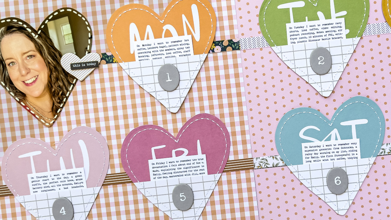
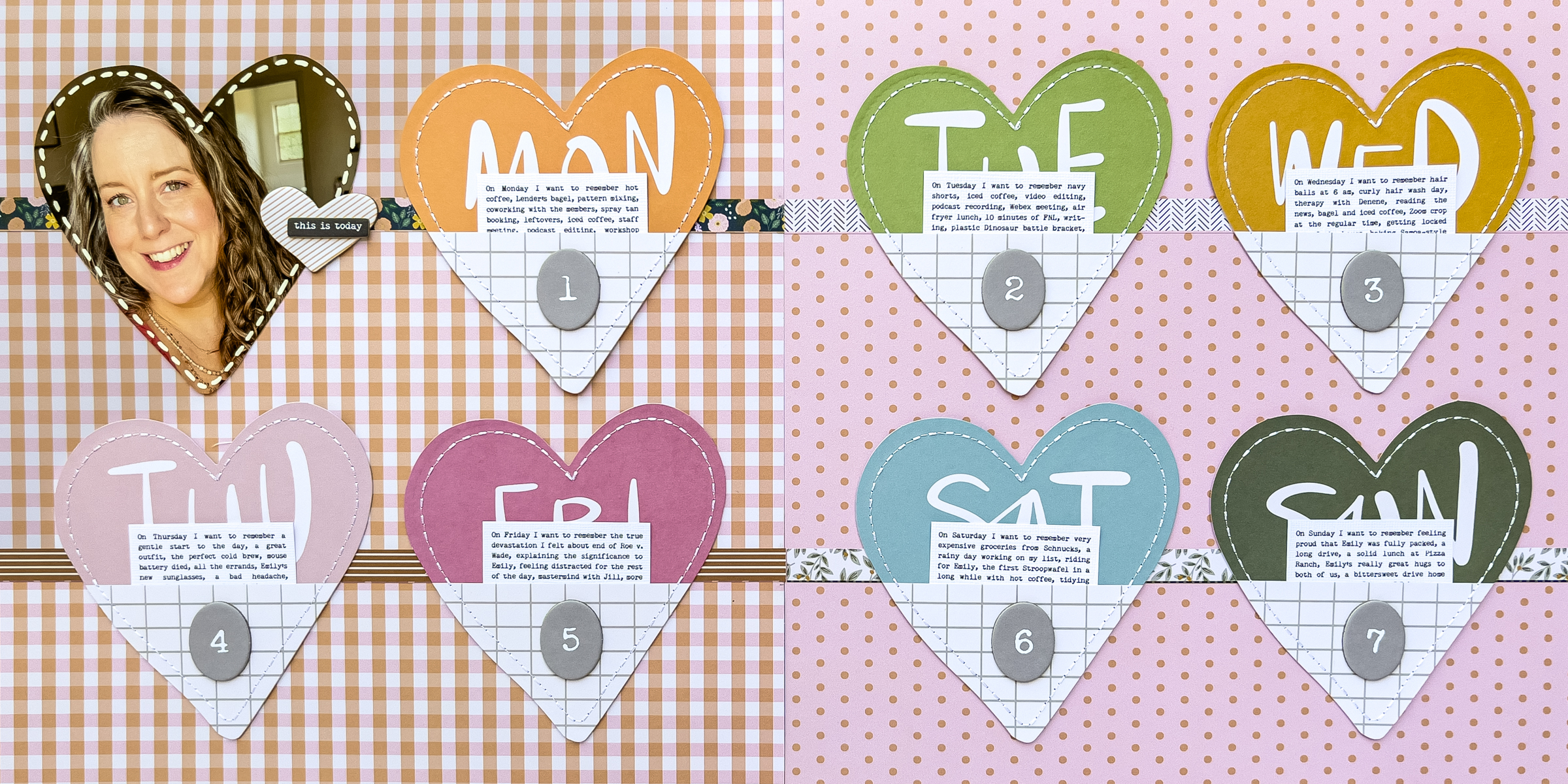
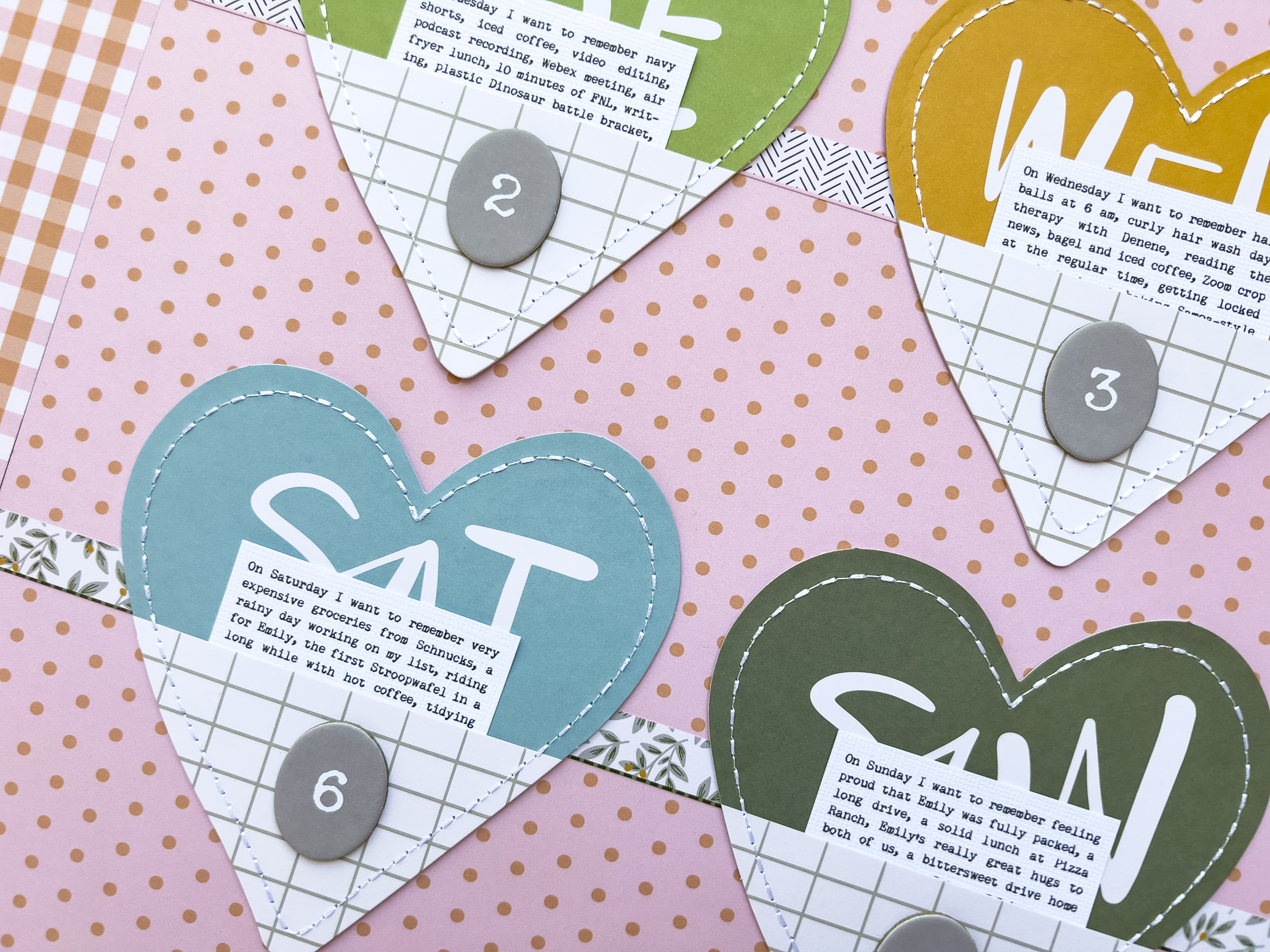
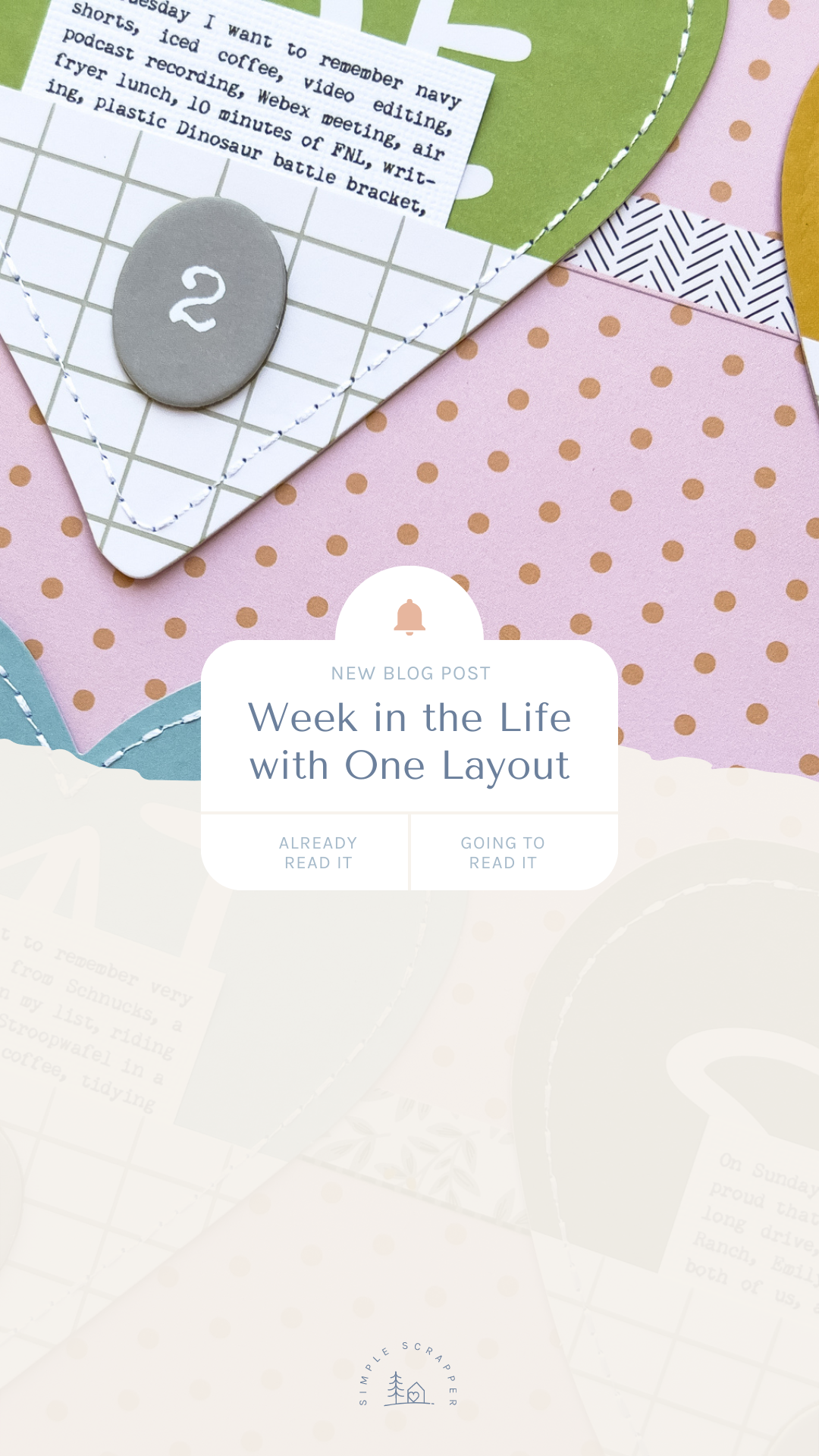
Those heart pockets from the 2022 Week in the Life collection completely inspired the composition of this double-page spread. I typed up “I want to remember…” journaling each day and printed it on cardstock. The photo was printed larger than the heart dimensions, then cut to match. The faux stitching is with a Uni POSCA paint pen. Papers are Jen Hadfield. All chipboard from my AE stash.
In addition, I originally didn’t plan on adding the branding strips, but I felt like the hearts were just floating in space. These paper pieces ground the pockets and draw the viewer’s eye across the spread. All of the repetitive elements make this Week in the Life layout feel cohesive, despite the contrasting background papers.
This was my first time creating one layout as my Week in the Life project. I have to say; I’m a big fan. I can see this becoming a thing with its own section in my albums. I love going all out with creativity at other times of the year, but Week in the Life brings a certain documentation intensity. Therefore choosing a simple, minimal approach makes sense for me.
I love this. As much as I love documenting my week, bringing it all together is a challenge. Thanks for sharing this!
Yes, it can feel like a lot.. which is why I’ve never done a full WITL project. I think part of it is that I just don’t have that kind of project stamina during the time of the year it usually takes place.
this would also be a great way to add details to a picture-heavy travel album. sometimes it really is more about the photo’s, but there are always tidbits of info that will give the trip more depth. love this, thanks for sharing!
That would be such a great idea! The first thing that comes to mind is doing a spread listing the food we ate each day of a trip.
love this simple approach! could be done so easily for other projects, or even regular snapshots of right now!
Yes, totally applicable to any kind of story.
Love this!
Thanks Carrie.
BRILLIANT! Opens all sorts of “IDEA” doors! A LOT TO PONDER! Thx! Not sure why eveRything is all caPs….
I just fixed the all caps thing!
So minimal such a great idea. Just get it done sometimes too elaborate means you don’t finish.
The stitches look so real. Did you make holes between the stitches to make it look more real or did you only use the Uni POSCA paint pen and do you have a link for this pen? I am guessing you used the fine point?
I only used the pen and it was actually a thicker point! I didn’t even think to add holes. I order my POSCA pens from Blick Art Supply.