There’s something about stamping on scrapbook pages that brings us back to the crafty days of childhood and inspires the inner collector in us all. Even digital stamps, especially word art, are being amassed in our libraries at a rapid pace. We love the possibilities of these supplies.
But are we using them? From lack of digital prowess to fear of messing up when it comes to inks, stamping on scrapbook pages can feel intimidating. In this post you’ll learn simple ideas to help reduce your stamp-related fear.
Stamping Ideas for Scrapbook Pages
Our creative team was inspired by Amy Alphin’s love of stamps to create their own pages and use a variety of techniques.
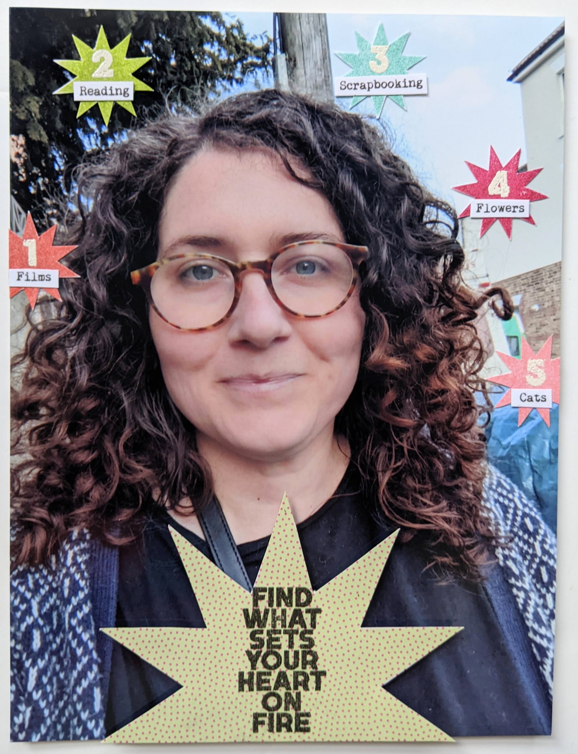
1. Emboss Your Embellishments
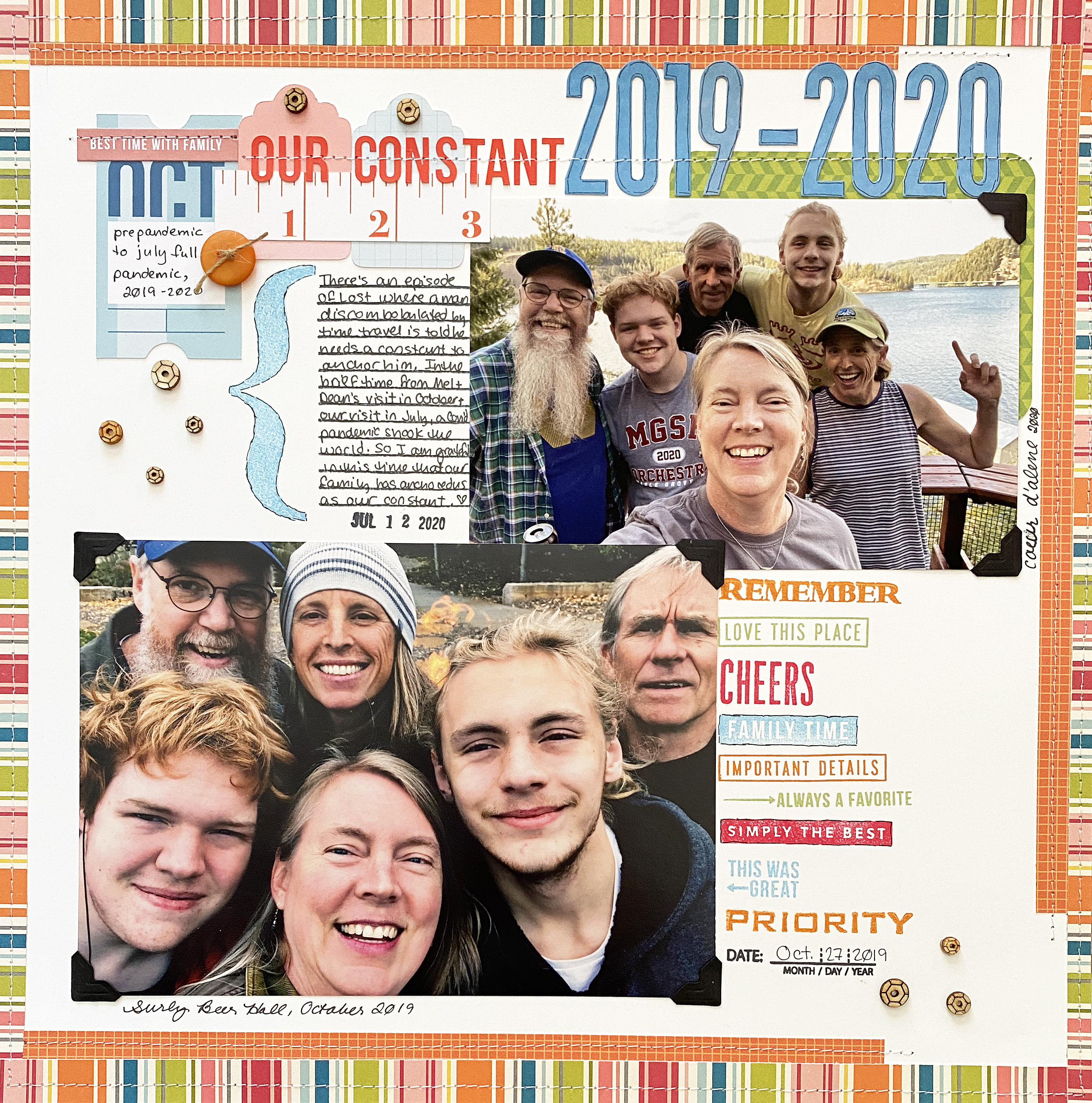
For this layout, Alexa Gill stamped starbursts in different colors, then embossed numbers in white on top. Layered with her typed list of favorites, these five embellishments help communicate her story in a simple way.
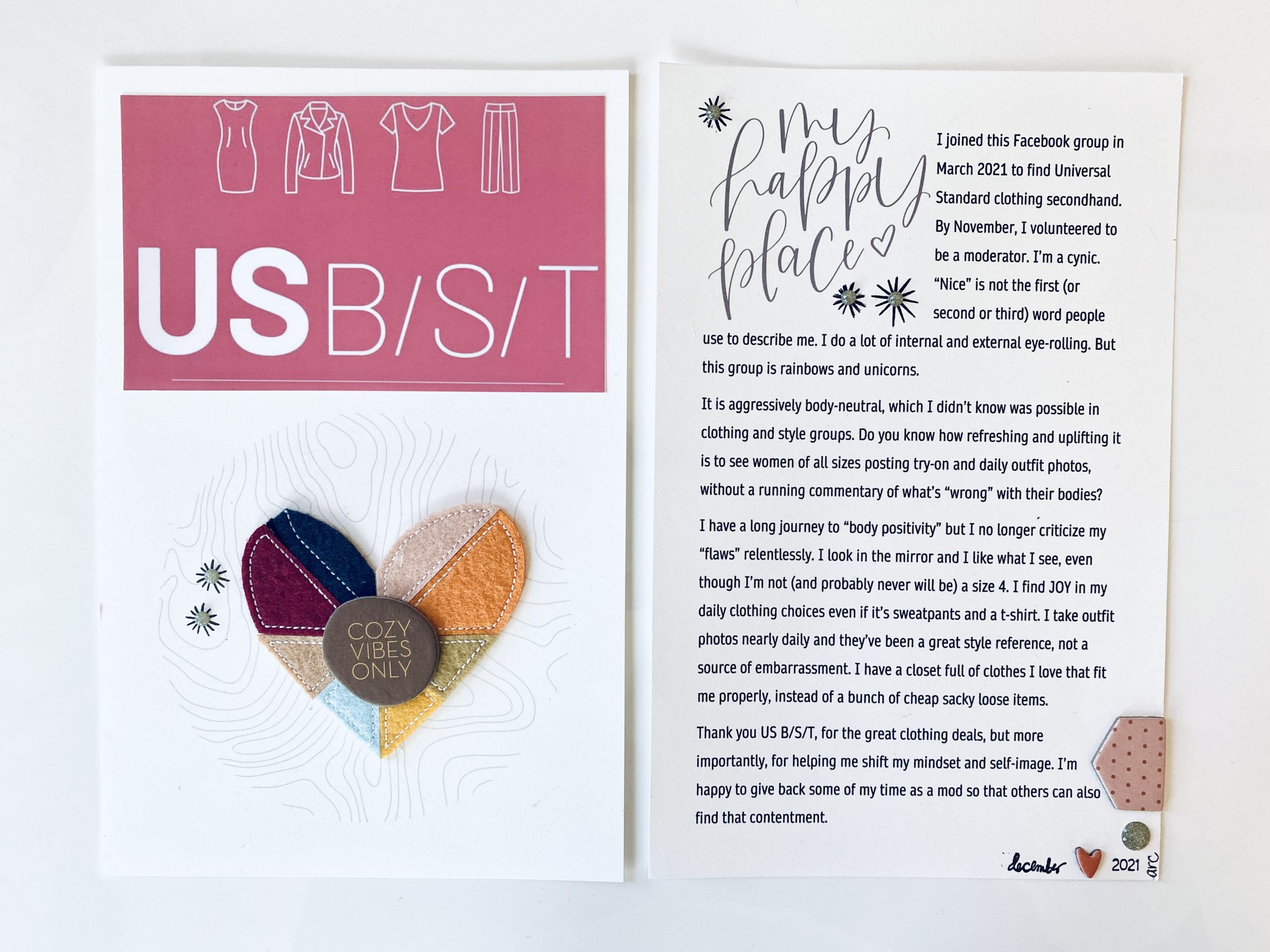
2. Hybrid Stamped Embellishments
Using digital stamps as part of your hybrid page design doesn’t mean letting go of dimension. Anandi Raman Creath added enamel dots on top of the starbursts that she printed on the background of her pages. This effect could also be achieved with a physical stamped impression.
3. Add Texture with Stamping
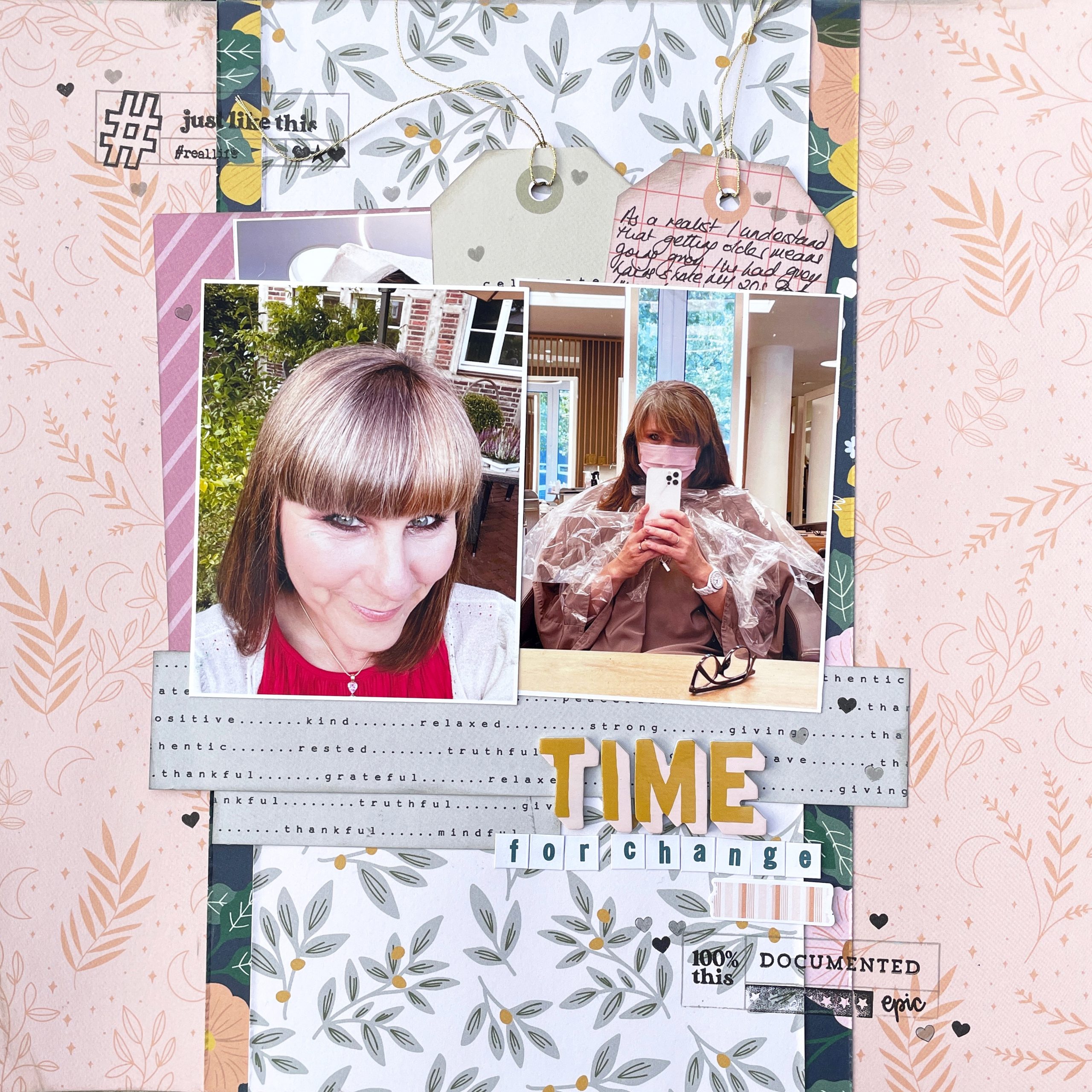
While our natural inclination is to make our stamps show up, sometimes what we really want is for them to blend into the background. Audrey Medd stamped a variety of patterned in light pink on a very light color of textured card stock. This adds texture without bulk to her page.
4. Stamp Multiple Times
Stamping, by nature, is an imperfect artform. When you stamp multiple times, layering each impression, you can create an artistic look on your background. On this page Cathy Caines used two different stamp sets to layered over a mixed media background.
5. Brand Loyalty with Stamps
Ettiene Rickles loves to combine stamps from multiple sets by a single designer or manufacturer. Brands will often have a consistent design aesthetic or use the same font faces in their products, making it easier to pair products together.
6. Adding Dimension to Stamping on Scrapbook Pages
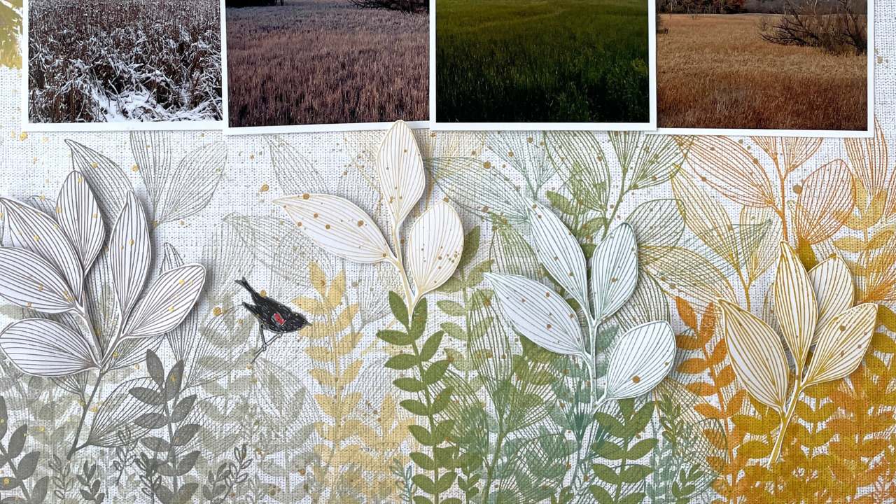
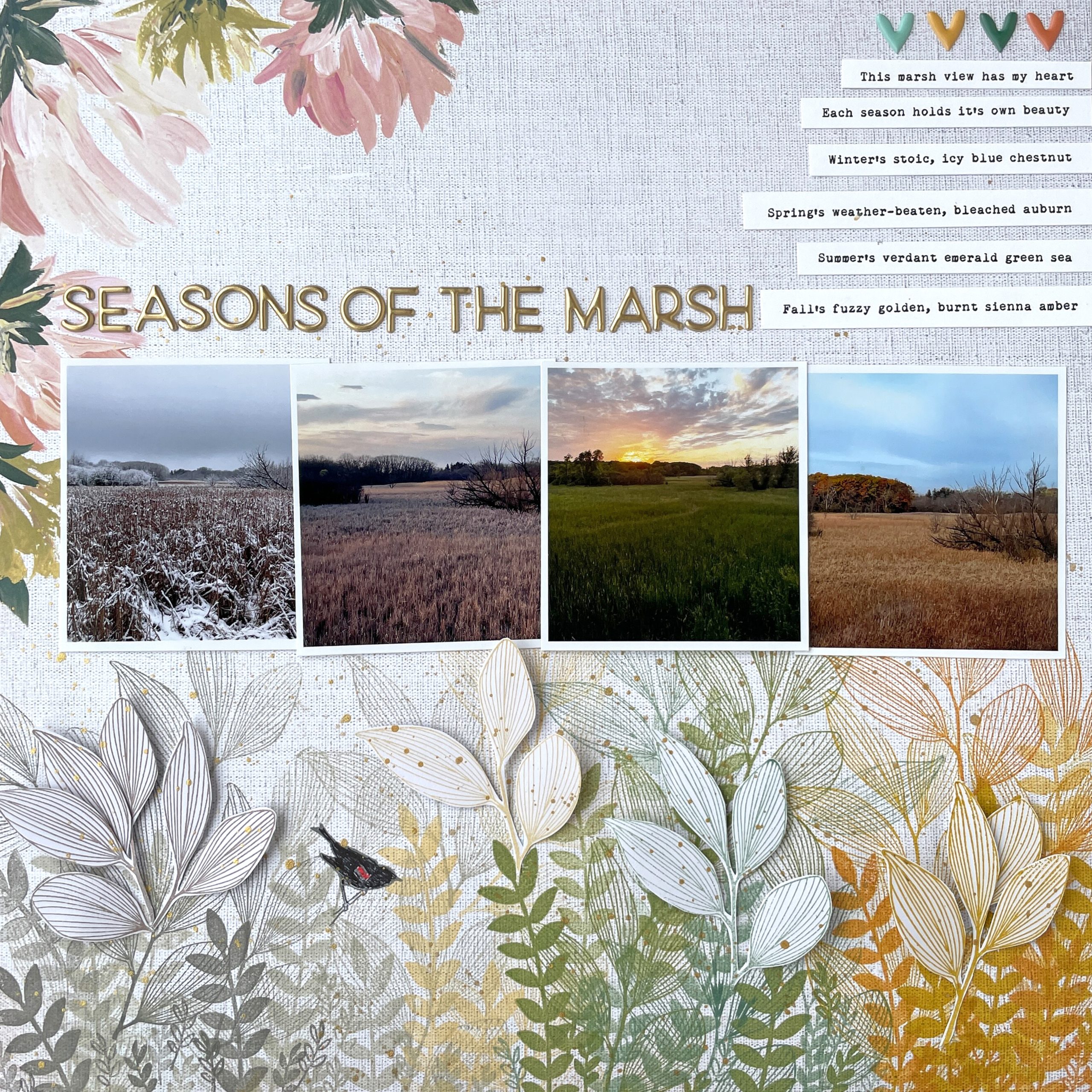
Stamping doesn’t have to be flat On this layout Helen DeRam first stamped leaf designs on her background in multiple colors, layering different shapes and sizes. Then she stamped one of the designs separately, cut it out, and adhered it to the page with pop dots for a dimensional look.
7. Digital Stamp Blending
Jan Sowder loves to create blended looks by clipping patterned papers to her digital stamps. Blend modes and transparency can also be adjusted to get the look just right for your layout. This is a great reminder not to assume any product only has one use!
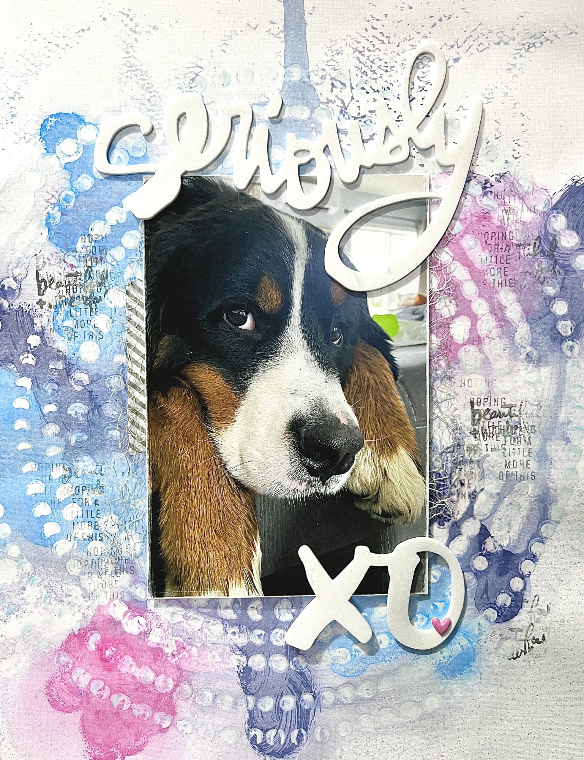
8. Digital Mixed Media
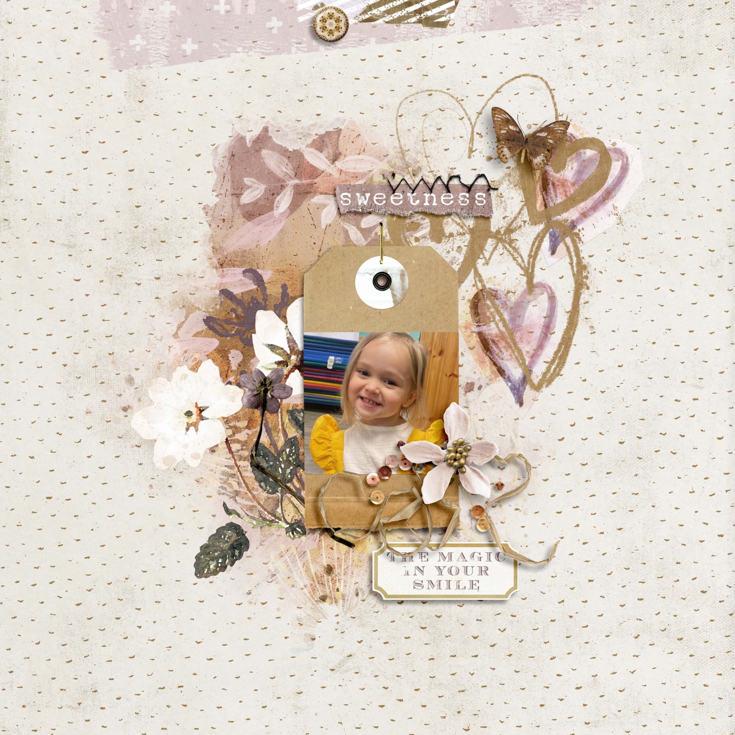
In this layout Jen Johnson used the design of her background paper to select coordinating digital stamps to place behind her photo. You might thing these mixed media style designs belonged to the same kit, but nope. Jen colored them to match her paper.
9. Multicolor Stamping on Scrapbook Pages
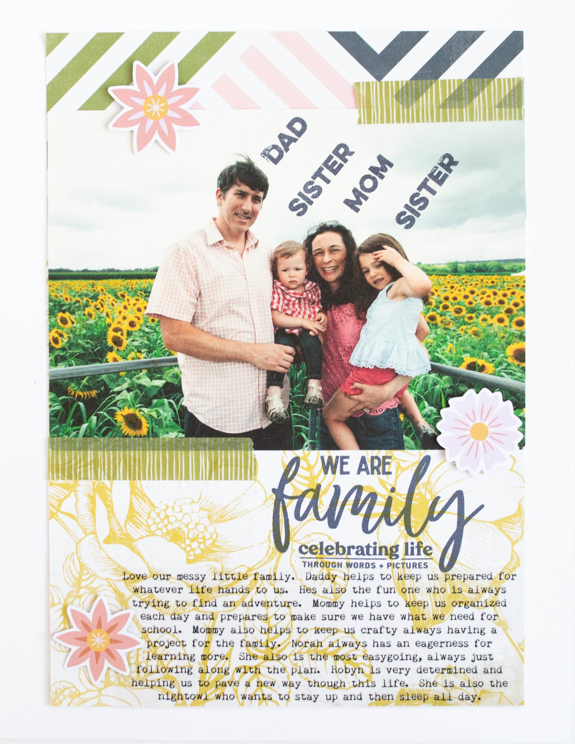
Jennifer Larson use multiple ink colors to make her cluster of stamped phrases stand out on her page. She also uses a technique to outline shapes with pen that have an imperfect stamped impression. There’s always a way to make it work!
10. Stamping Inside of Shapes
Many stamp sets come with grids, blocks, or other shapes that can become homes for collections of smaller stamps. Lisa Hausmann used these grid blocks on her layout to add creative interest with a number of sentiments and designs.
11. Choosing Ink Colors for Stamping on Scrapbook Pages
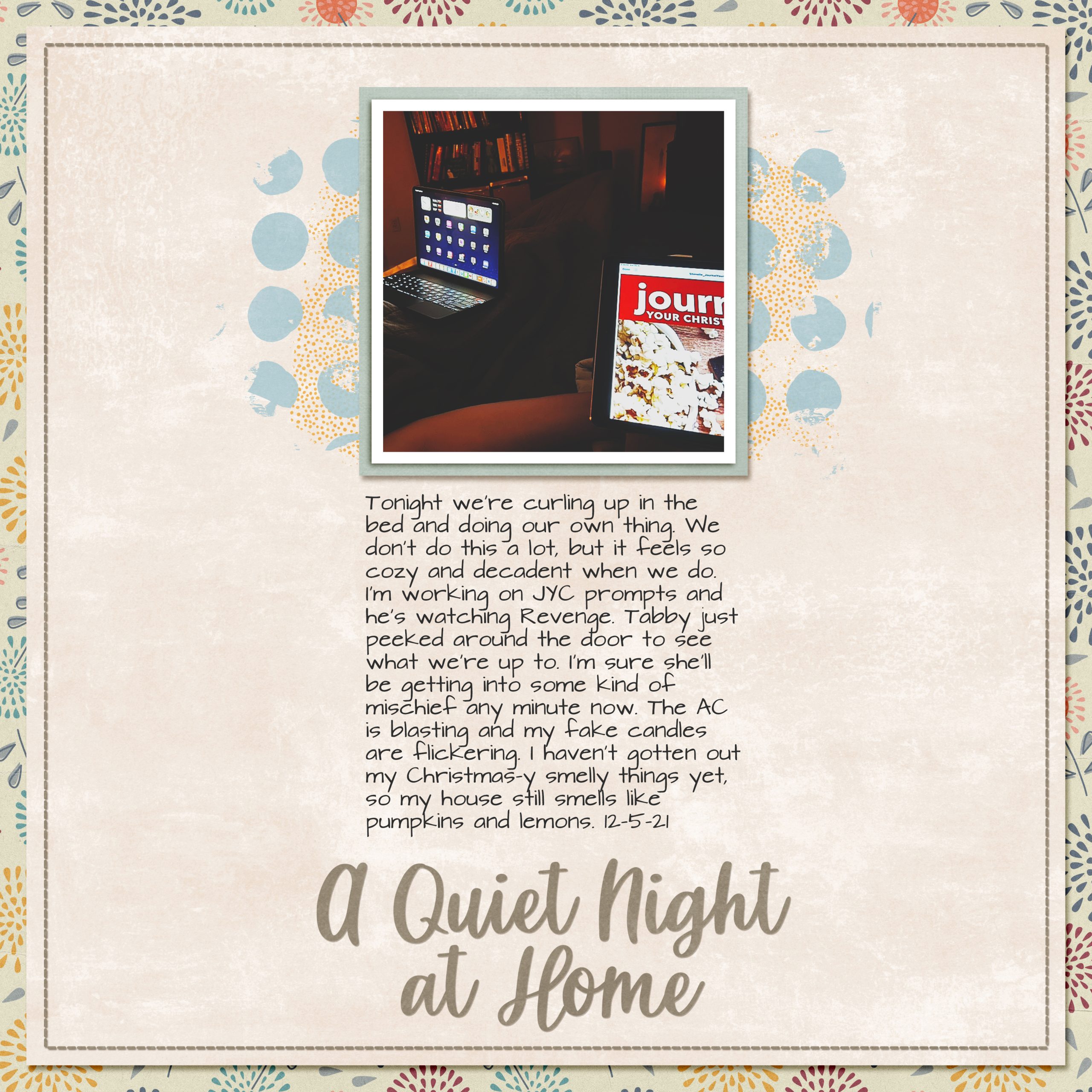
On this layout, Amy Melniczenko recolored her digital stamps to match the patterned papers she chose and bring cohesion to the layout. With paper, this would like choosing 2-3 ink colors to match the most colorful or busy patterned.
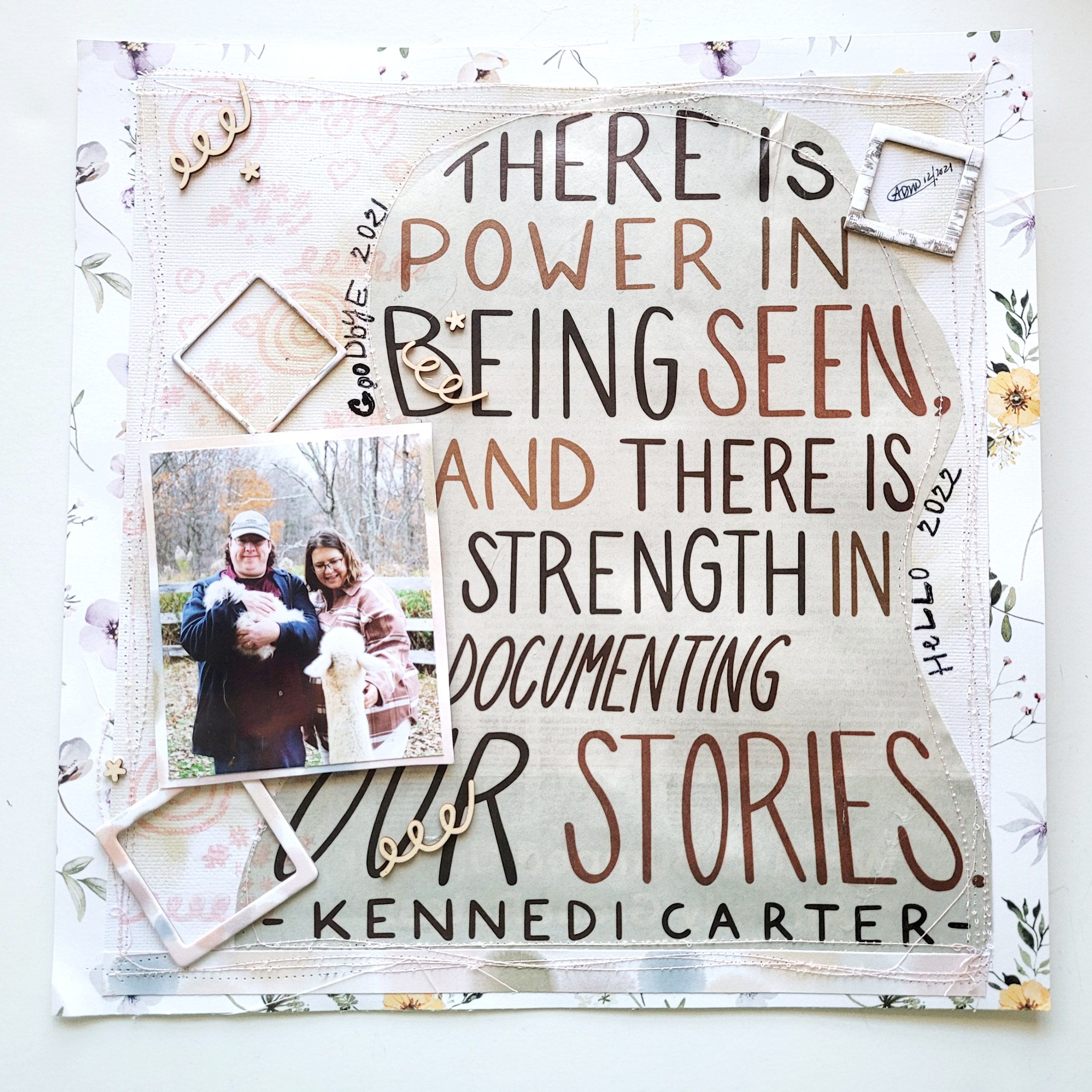
12. Stamps as Photo Overlays
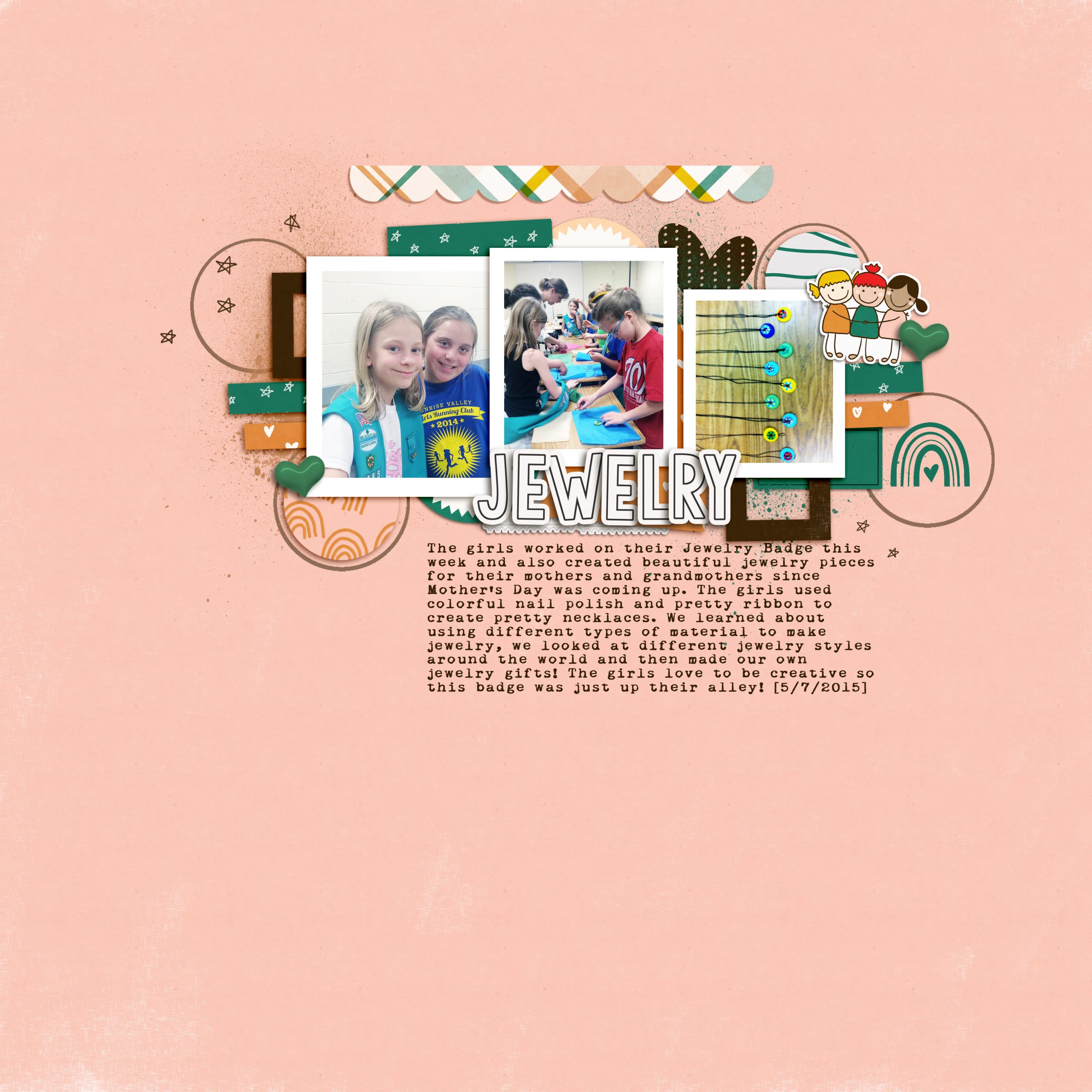
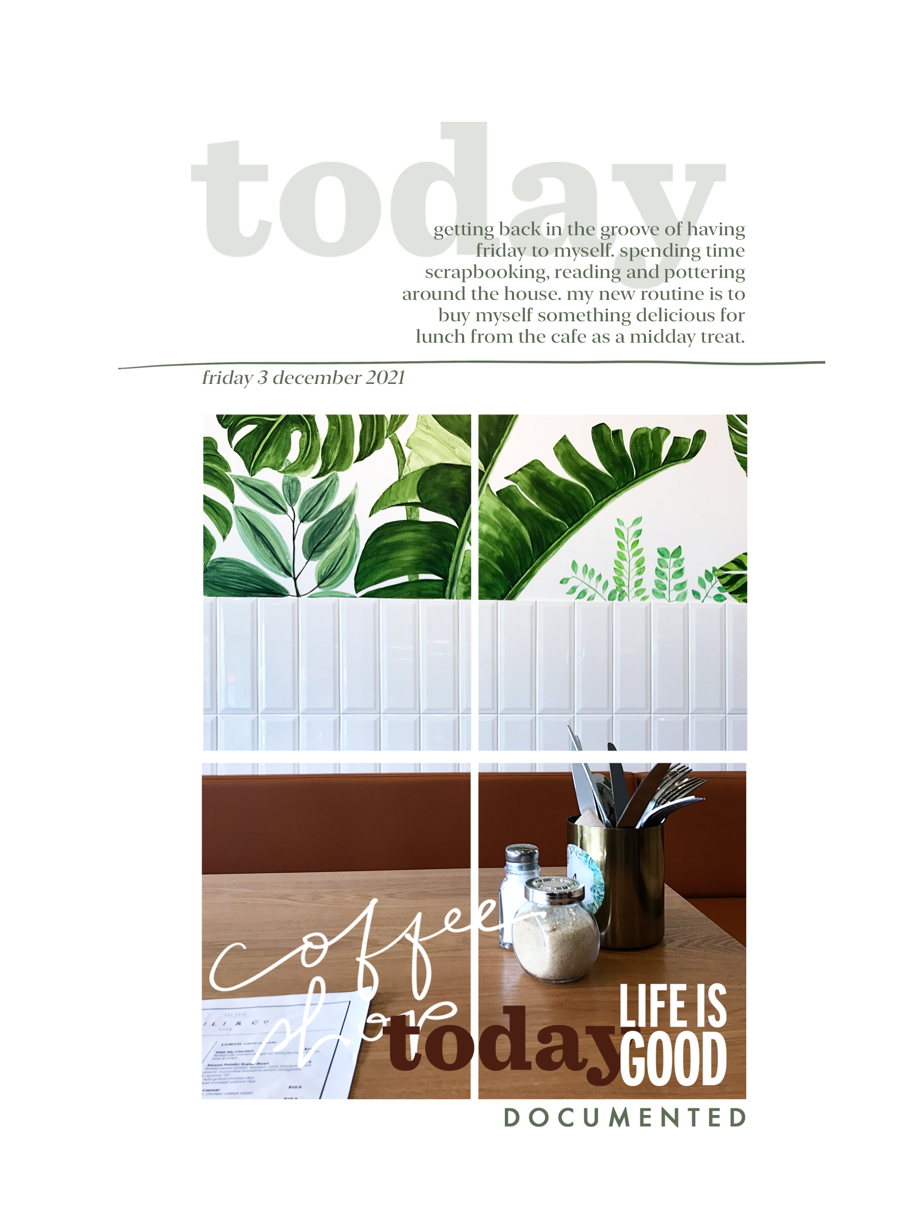
Shannan Manton overlayed multiple digital stamps in this page to create her title and embellishments. By adjusting both the color and transparency she was able to make sure each word or phrase was both visible and legible.
13. Stamps and Paper Piecing
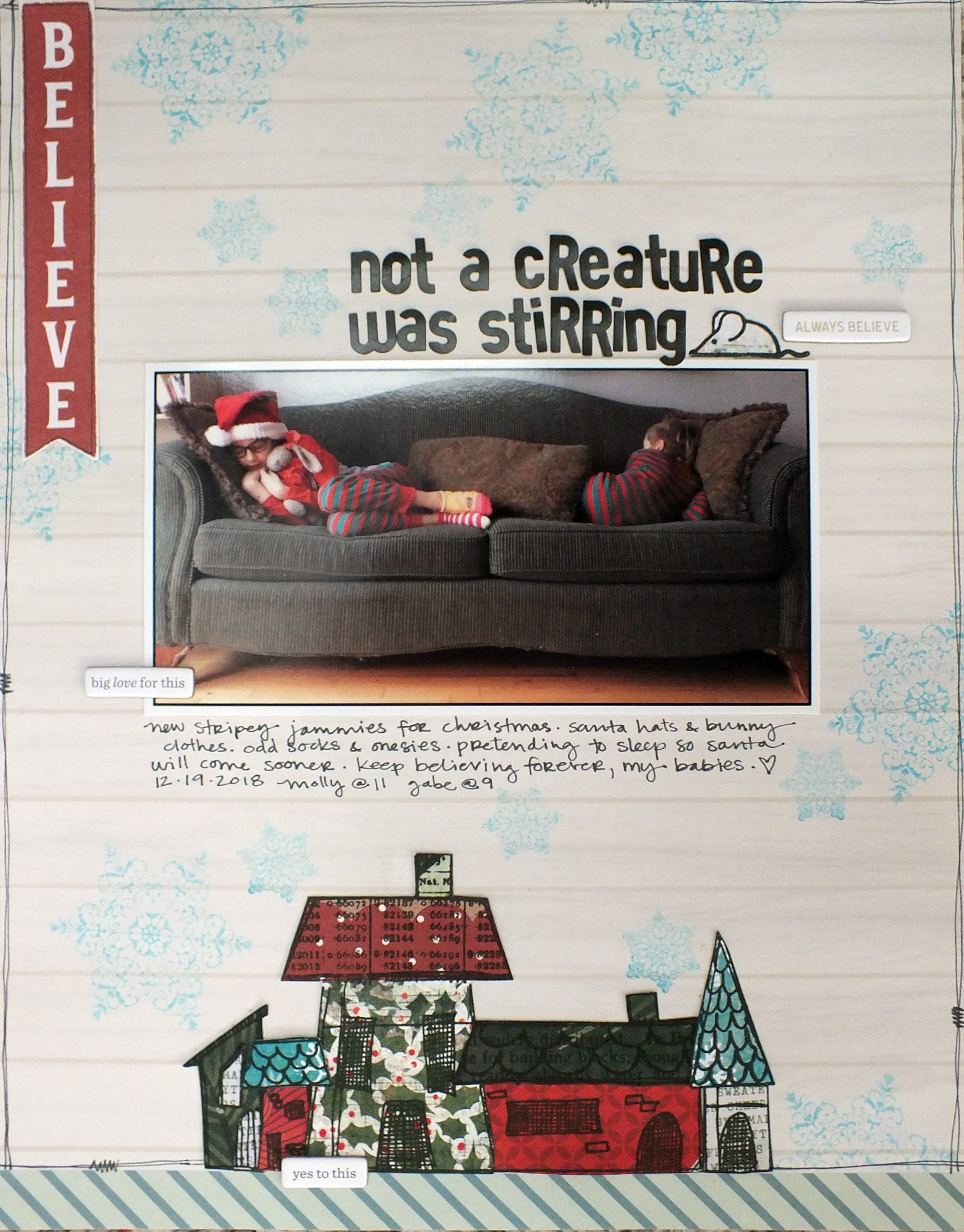
In this layout Sara Case not only stamped on her background patterned paper, but use these house-shaped stamps on patterned paper. She then pieced them together to form a scene of stamped images on her scrapbook page.
If you have a stash of stamps not getting a lot of use, maybe one of these ideas will be the trigger to try something new.
Tips for Stamping on Scrapbook Pages
As you include more stamping on your scrapbook pages, it will become more of a habit. But you don’t have to dive in to some of the more advanced techniques our team has shared. Here are four starting points and one extra-important reminder to jumpstart your journey of stamping on scrapbook pages.
- Start There – Pull out your stamps as part of building your page’s background.
- Make a Border – Word phrases look great when stamped along side a photo or paper.
- Try Monochrome – Create a subtle effect by stamping in a color close to the background.
- Stamp the Title – Larger stamped images can serve as a title with no letter stickers needed.
- Go with the Flow – Embrace the imperfection of a stamped look on your scrapbook pages.
For additional tips, check out SYW016 – Don’t Be Scared of Stamping and SYW111 – An Epic Plan to Organize Stamps. And make sure to save this post so you have it for reference later!
Each of these pages were fantastic, but Helen’s was simply marvelous! It not only spoke to me, but I actually think I could take her technique and replicate it. Thanks, Helen, for keeping it repeatable!
I’m more comfy using digital stamps, but have tons of regular ones – I will try to make some use of them. Paper piecing is my favorite.
these are great examples of using stamps and I know I will actually use some. I definitely see myself using the Light/dark/transparency look on Number 12.
hi