Ever look at layouts and ask yourself why they are so darn visually appealing? Wonder what tricks are up the sleeve of all those girls on fabulous creative teams? Here’s a few tips (or reminders) from which any digiscrapper can benefit.
1. Use clusters
Take a look at some of your favorite layouts. What do they have in common? Most likely, the answer is effective use of clusters. By grouping elements in an area, along one direction or around an object, you create a focal point for your layout. That is the spot that screams: “Look Here!”. And it’s not always (or usually ever) in the center. Use clusters to create that special spot and then add other elements to balance the look. Just play around until it feels right or use a fave as inspiration.

LO by Krakatuka: Effective use of clusters with a great focal point
2. Make your own quick pages
Ever notice how beautiful many Quick Pages are? It’s not just because the designers are awesome (though that is true, also). Pick a general theme and start scrapping without a particular photo in mind. Leave space for a photo using a frame. Combine all the layers beneath the frame and then cut out the space. Make sure your background is transparent! Save as a PNG and you’ve got a fabulous “page in waiting”. While this route doesn’t always make sense, its a great way to stimulate your creative juices and get thinking outside the box.
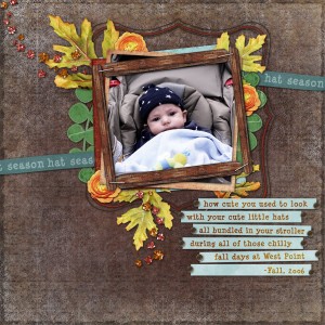
LO by JenLin: An good example of a design well-
suited for a personal quick page or “page in waiting”
3. Mix & match kits
Full-size and mini-kits are super easy ways to get coordinated pages done in a flash. I would bet you though, that you have a design style or two that appeals to your senses. This means elements from different kits might go together beautifully. To start slow, pick a paper and a few elements from one kit. Then go on a hunt through your stash for a few coordinating items. You might just be surprised by how this approach freshens up your layouts.
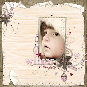
LO by hawra_sk: Beautiful clustering with elements from multiple kits
I hope these few ideas were helpful. They truly are “easy”. Do you have any tips to make your layouts really pop?

hey, this is super beautiful
Very nicely done! I made quick pages before they had a name. lol
It is nice to see them catching on now and being appreciated.
Love your pretty clusters too!
Thena
Thena’s last blog post..
These are fab tips, Thanks for taking time to share this!
Mary’s last blog post..
Really lovely layouts you’ve featured!
Thank you so much for featuring my LO. I’m so flattered! Love your tips, too. Happy Holidays!
Jenn’s last blog post..News, New Products, and a Holiday Freebie!