I often get stuck in the title work blahs, from both the design and creative wording perspective. I’m primarily a digital scrapper, and I’ll find a favorite font, apply a style that gives it some dimension, and use it again and again for a one- or two-word title. In a word, boring!
To get myself out of the rut, I decided to investigate what makes the title work of layouts stand out from the crowd. Although fantastic title work can be created with the use of a Silhouette machine, with masks and spray mists, with stamps or printed “word art” stickers and tags (to name just a few options), I’m not discussing those here.
Furthermore, because there are a whole set of different options available in the digital scrapping world (for example, reverse type subtitles can easily be created on the computer), this article focuses on traditional letter/alphabet products.
After looking through countless layouts, I found that variety and contrast between the pieces of the title phrase make for more interesting and eye-catching titles.
For phrase title suggestions, check out Peppermint Creative’s Title & Phrase Guide. I’ve used phrases from the Spring category in my examples below.
Obviously, there are countless combinations and no strict rules to how to put products together. Let’s look at a few of the currently available product options and how they could be used on a layout:
Mix bigger letters with smaller ones
This combination is especially effective when you want to highlight one word in the title phrase such as “first signs of SPRING” using larger letters.
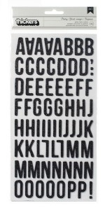
Black Pantry Fresh Squeezed Glitter Foam Thickers by American Crafts
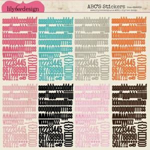
Happily Lost Collection 12 x 12 Cardstock Stickers by Lily Bee Design
Although a sticker sheet doesn’t provide dimension to a layout in the same way that a chipboard alpha sticker does, it’s an affordable way to get a combination of large and small letters onto your layout.

A Boy’s Life 12X12 Alphabet Stickers by Echo Park Paper Co.
Mix materials
Combine a large wood alpha with smaller, non-dimensional sticker letters
Another option for a phrase title with emphasis on one or two of the words, such as “spring is in the air”.
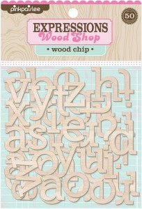
Wood Chip Wood Shop Alphabets by Pink Paislee
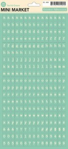
Sidewalks Mini Market Alpha Stickers by October Afternoon
Combine corrugated paper letters with smaller, non-dimensional sticker letters
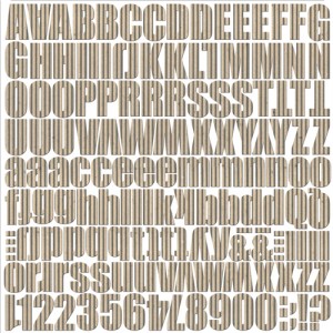
Kool Kraft Corrugated Alphabet by Jillibean Soup
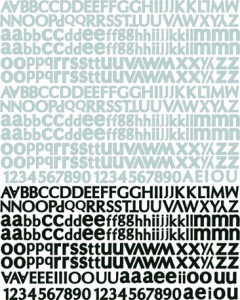
Nature Garden Collection Textured Alphabet Stickers by Prima
Mix similarly sized alpha of different colors
This option works well for phrases such as “A DAY IN MAY” where no part of the phrases gets more emphasis than the other, or for combining names or initials on a layout as in “W & J”.
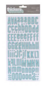
Waterfall Doll Fabric Chipboard Peachy Keen Thickers by American Crafts
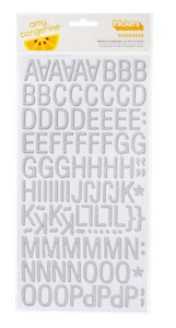
Amy Tangerine Goodness Slate Printed Chip Thickers by American Crafts
Mix capital letters with lower-case letters (of the same color)
This option works well where one or two words of the title phrase are being emphasized such as “a BOUQUET of spring” or “a bouquet of SPRING”.
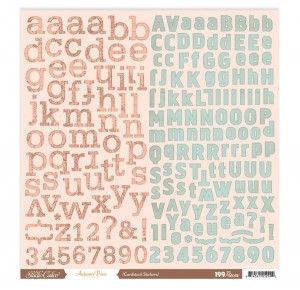
Autumn Press Alpha Sticker Sheet by Studio Calico
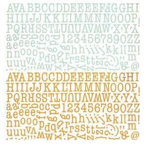
Picadilly Alphabet Stickers by BasicGrey
Mix block letters with italics or script
The use of this combination depends on the sizes of the two letters being combined. If the two alphas are more or less the same size, use it for titles where no one word gets more emphasis such as “Spring fling”.

Waterfall Doll Fabric Chipboard Peachy Keen Thickers by American Crafts
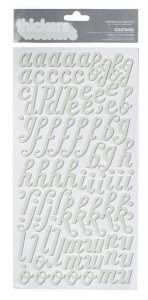
Garden Cafe Pond Custard Foam Thickers by American Crafts
If the block letters are larger than the italic letters (or vice versa) use the combination for emphasis on one of the words as in “hop into SPRING”.

Amy Tangerine Goodness Slate Printed Chip Thickers by American Crafts
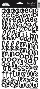
Beetle Black Loopy Lou Letter Stickers by Doodlebug Design
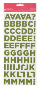
Country Picnic Collection Corrugated Alphabet by Pebbles
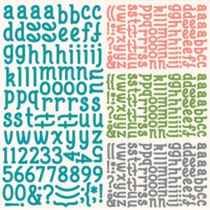
Bright Side Alphabet Cardstock Stickers by Lawn Fawn
Inspirational Layouts
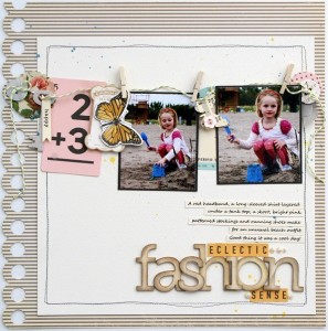
Eclectic Fashion Sense by Sarah Webb
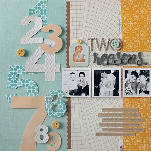
Two Reasons by jacksonsmama
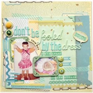
Don’t Be Fooled By The Dress by amyheller
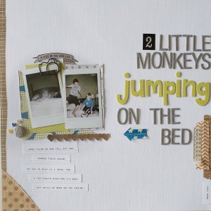
2 Little Monkeys by AllisonWaken
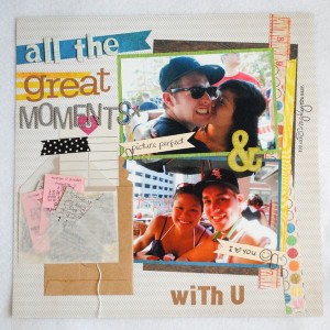
All The Great Moments by nngo409
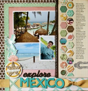
Explore Mexico by NancyDamiano
Contributing Writer and Team Leader Jean Manis loves to scour online shops for the perfect products for her simple scrapbooking projects.

This is a really great post, and I was sad to see that there weren’t any comments!! Thanks for the wonderful share! I love to mix alphas in my titles. Here’s an example of a layout where I did that from this past weekend:
http://www.twopeasinabucket.com/gallery/member/428396-fromwatsonwithlove/1857947-little-dark-knight-gossamber-blue/
-Gabi from Denton, TX