
This installment of the Take Two series shows how to combine two single-page templates from the Simple Scrapper Premium Membership Library into a single-page layout.
I wanted to scrap a single-photo layout using the paper scrap style that’s recently caught my eye in galleries. I was immediately drawn to two templates from the November 2011 release.
I actually didn’t scrap either of these templates when they were released last November – so this will in fact be a First Take.
I started by considering the single-photo template, since I knew that I would be scrapping just one photo. I opened that template up in Photoshop.
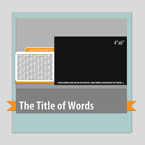
I saw the potential of using the four photo spots in this other template for paper strips.
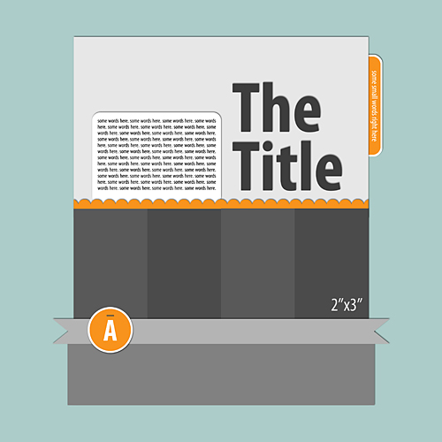
To begin the merge of the two templates, I selected the four photo rectangles and the scallop border from the template shown above and dragged them into the single-photo template. At the same time, I deleted the title and the paper behind the title on the single-photo template.
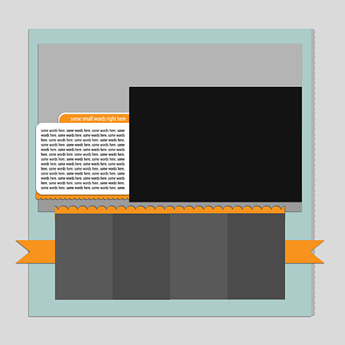
It was obvious that I needed to resize the photo rectangles, which I would be using for the paper strips, to match the sizing of the mat behind the photo and journaling box. At the same time, I simplified the journaling box.

At this point, it was time to choose digital papers and elements for my layout. Since I was scrapping a photo of my husband and our two sons, I wanted a masculine-feeling collection. Also, because I was going to be using a mixture of patterns, I wanted a digital set that would include a large variety of patterns. I ultimately chose the Echo Park Note to Self collection after unsuccessfully trying to do some mixing and matching of papers from several different kits.
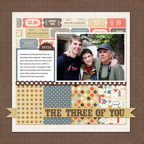
I added my photo and my journaling to the template, and then began to try different papers in the various locations. One advantage to the digital approach is that I was able to scale the patterns to my choosing. This could be achieved with traditional papers by using both 12” x 12” and 6” x 6” papers in the layout. The Note to Self collection comes in both sizes.
At the same time I added a stroke and a small embellishment to the journaling box.
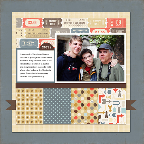
After letting this layout sit for a while, I made a few changes with papers and embellishments: I added a border, changed the paper for the ribbon and switched out the two background papers.
I tried adding the title on top of the patterned papers but was unhappy with the effect. The titlework simply didn’t stand out against the patterned paper.
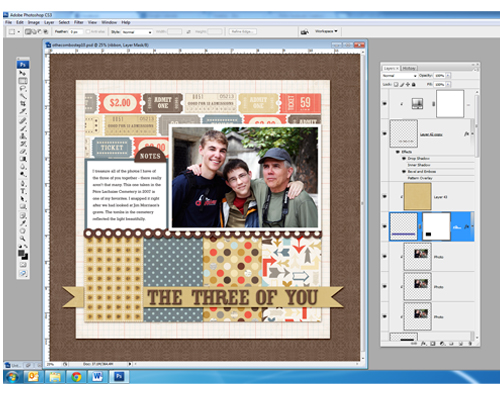
I brought the ribbon out from behind the patterned papers and added my title with the alpha from the digital set. I decided to weave part of the title behind the paper. With the ribbon layer selected, I selected the area around the paper behind which I wanted to tuck the ribbon with the marquee tool.
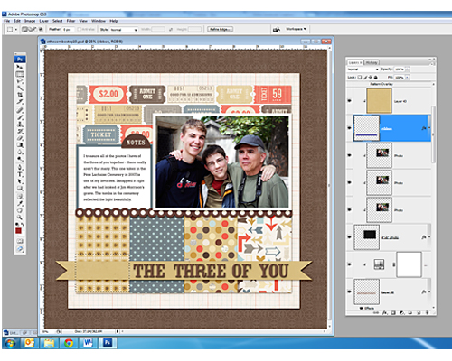
I did a “select inverse” and added a layer mask. I could have simply deleted part of the ribbon, but I prefer to use non-destructive methods in Photoshop when possible.

0 Comments
Trackbacks/Pingbacks