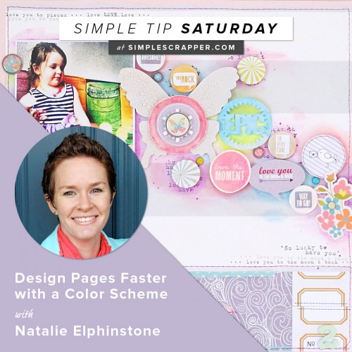
As part of our Simple Tip Saturday series, we’re inviting fresh voices into the mix. Today we’re hearing from Natalie Elphinstone with her simple tip.
What is one way you simplify scrapbooking?
I stick with a colour scheme to scrap my layouts. I tell myself before I start that I’ll only use grey, pink and green for example and then I’ll use that to form the basis of my page. A few little bits of other colours might sneak in, but I’ll make sure they don’t distract from the main focus.
What problem does it solve for you?
Having accumulated quite a few scrapbooking supplies over the years (haven’t we all?!) I find I can waste so much time sifting through it all to find “something that will work” for my page. At the end of that process I might have unearthed 5 different sets of brads in all the colours of the rainbow, when all I need is one. If I limit myself to a certain colour scheme before I start the hunt then I’ll stop after I find the first pink one because then I know that will be perfect.
Why do you think it works so well?
Having a predetermined colour scheme means my pages come together in a cohesive fashion. It means they are more pleasing to the eye, especially if you stick to the design principle of gallon/quart/pint which means using one very dominant colour, one accent colour and one for small highlights.
How can others get started with it?
There are many ways to chose a colour scheme. Some of the common ways I use is to stick to scrapping with just one collection or a kit, or take part in a colour challenge or Mood Board challenge which can be found on many blogs. Find a photo that includes similar colours, or print one in black and white so it doesn’t clash, and then start scrapping!
Simple Tip Saturdays are for sharing easy ideas to grab and go. Would you like to be featured? Complete this form to submit a tip for consideration.


I never realized that I did this, but I do this too! Not only does it make things quicker and more simple, it’s a strong design decision too!
i, too, select my color scheme first — Yellowstone National Parks were mostly greens and tans; Hawaii were mostly blues and tans, Mt. Rushmore, currently working on will be blue, green and some yellows.
How would you approach a heritage album and choosing a color scheme? Would you stay with the same color scheme throughout the album or is it OK to change color?
Lynn, I think that is personal preference and dependent on the photos you are using. If all of the photos have the same tones, it would certainly be easier to use a similar color scheme; but if they range from sepia tones of the early 1900’s to vibrant neons of the 1980’s I imagine that will be tough to do! Using the old paint analogy for color selection you could do everything on the same foundation color, such as kraft or white (your ‘gallon’ of color), then use another neutral as a supporting color, such as black or navy (your ‘quart’ of color) and finish it off with small pops of color that complement your photo (your ‘pint’ of color). This could give you the consistency you want but make it easier to create pages that work with your photos!
I too find using a color scheme makes it an easier process and a more cohesive look . I have quite a collection of paint chips I use…..the color schemes are already layed out for you!