Trends in the craft world seem to come and go as often as flared vs. skinny jeans. While what’s hot right now doesn’t necessary affect your own scrapping, it can affect what is available to purchase.
So today, please share one or more trends you are seeing in the shops and galleries. Make sure to comment on trends others identify too!
- What new trends are you spotting?
- What do you think of these trends?
- Are there any trends that you adore? or drive you bonkers?
- Do trends affect how you scrap? or what you buy?
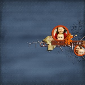
Here’s one trend that I’ve spotted: the shrinking of clusters on white space layouts. We’re getting “supa” tiny in some of these. This layout from jenn7 is a beautiful example.
Your turn to chime in on trends in digital scrapbooking!


What a beautiful layout featured!
I’m really over the bird/owl trend, anxious for something else, don’t know what else, but really over it 😉 I was also a fan of sketches but lately they tend to feature circles, many, many circles and blend together. Perhaps every sketch that can be sketched has been created, but it is now becoming very dull. Certainly the trends effect what I buy, but I tend to be a very simple scrapper, linear and photo based. Seriously considering digital – seems flexible and certainly tidier!
I totally agree with the owl trend. That was the first thing I thought of when I read this post. Owls are popping up in so many kits and I just don’t get it.
I never did care for the owls. If they’re in a kit I buy, I just ignore them.
My scrapping is all about the photos. So I just don’t get having really tiny photos and a lot of empty space. I also don’t care for the fantasy trend.
I have a husband and 4 children. I need to put multiple photos on a page. While I think fantasy layouts are gorgeous and so enjoy looking at them, I just really don’t have time for it.
I agree with the other ladies. It seems designers get hooked on one element like owls, birthdays, etc. and then they all do it.
I love traditional scrapbooking in a digital form. I like realistic designs for my photos. Isn’t that what it’s about – the photo(s)?
LOVE the artsy things too but I feel that the whimsical and fantasy type kits have just gone too far. They explode with unrealistic scenes and I find it hard to work with. Sure they are beautiful and fun, but not for me. I’m also seeing so many designers that have their own style falling into this pattern… I would design one or two for fun but stick to my own art.
I’d love to see more items that are real as though you were buying them in a store. It seems to be a dying breed though.
Love this topic for a discussion! I think you targeted the most obvious trend – the cluster on majority white space. My personal opinion is that these LO’s are created to focus on the digital kit being offered more so than the photo being scrapped. I guess one CT designer tried it and it caught on and now it’s everywhere! While they are beautiful pages, to me it’s a sad trend… I know we all love the kits/paper/embellishments but I certainly don’t want to see 10 square inches of nothing with a tiny 1 1/2 inch photo of my child. I seriously can’t constrain myself to that small a photo – I want them to be the focus of the page, just like they are the focus of my life, LOL! Not trying to hurt anyone’s feelings who does use this style, just my opinion.
…I agree, Carri – it’s all about my family and my photos – and for that reason I also look for kits that will accentuate (not overpower) the photos.
Similarly, I love pink and purple, but not very many of my outdoor photos shine if I use those colors for my papers and elements, so I find myself loving the kits that use more neutral colors.
I went to the first page of twenty layouts at an unnamed digital gallery and here are a few things I noticed:
-one photo appearing more than once on a layout…either as two different sizes or one used as a background
-the use of “stardust” or bubbles for a fantasy feel
-colour photos
-small (or no) titles
-only three pages had (a very small amount of) journaling
-worn/distressed backgrounds
-realistic nature elements
-only one layout featured an adult
Obviously, this is just a sample of what’s going on in the world of digital scrapbooking. But I always find it interesting to see what everyone else is doing.
Over the last few months I have really simplified my style. I use elements sparingly. I always have photos, a title, and journaling. Anything beyond that is just icing on the cake. I am sticking to basic designs on (mainly) white backgrounds.
As much as I enjoy the elaborate pages, I just don’t want to spend so much time doing them anymore.
extractions still seem to be a big trend and while they are fun in an artsy sort of way, I have to think someday all these kids will grow up and ask why they were always sitting on mushrooms or tip-toeing through the virtual tulips. I like to portray everyday life on my layouts. Trends don’t really change the way I scrap but I do watch them for ideas.
I do both paper and digital, and I more or less ignore the trends. I digi-scrap with the same style I paper scrap. I’m not into the super small photos and a bunch of white space, although I’ve been pushing myself to use a *little* white space and not always completely fill every inch. 🙂
I think that if the tiny clusters make people happy, more power to them. I’m just not going to participate.