I recently recorded an episode of our members-only podcast with Cathy Caines, who shared a fun idea. She’s printing a collection of her favorite photos layout-sized, to be used as the background for upcoming scrapbook pages.
I love this intentional design choice and how it really elevates the importance of the photo. I have used this technique on a variety of pages over the years and have enjoyed the result. It’s a fun way to get out of my creative habits and see page composition a little differently.
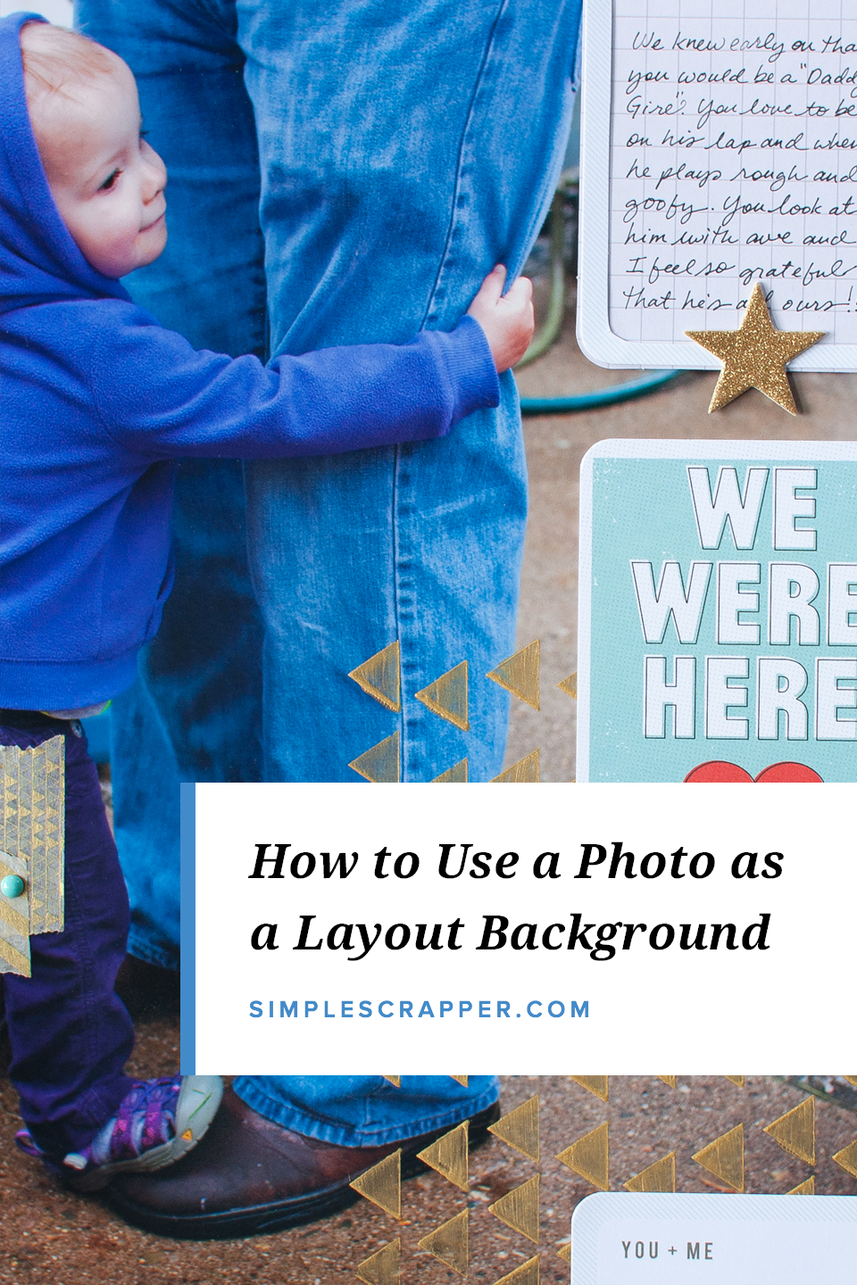
As you browse through this pages, take note of the use of white space as the focal point for embellishment in each photo.
This page began with a challenge to paint on a photo. The perfectionist in me shuttered, but I did it and I love the result.
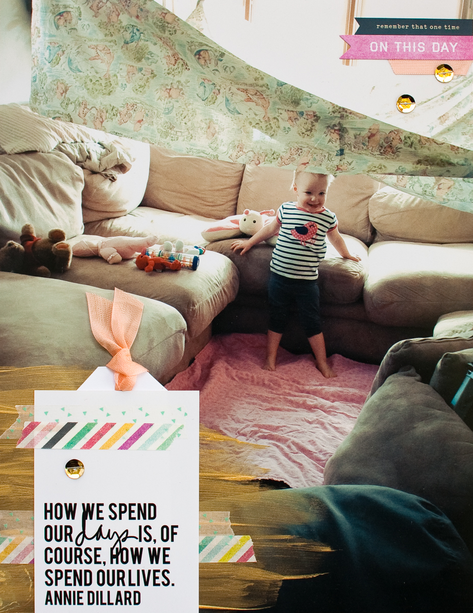
My layouts tend to be uncomplicated in structure, but I enjoyed the 3+ hour investment into this page.

I cured my nerves about scrapbooking on the photo by creating the patterned paper column separately and then adhering it.
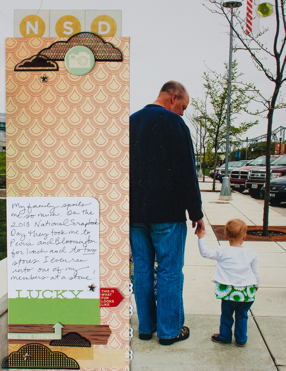
When cropping this photo, I purposefully placed the subject on the left one-third line to allow space for embellishment.
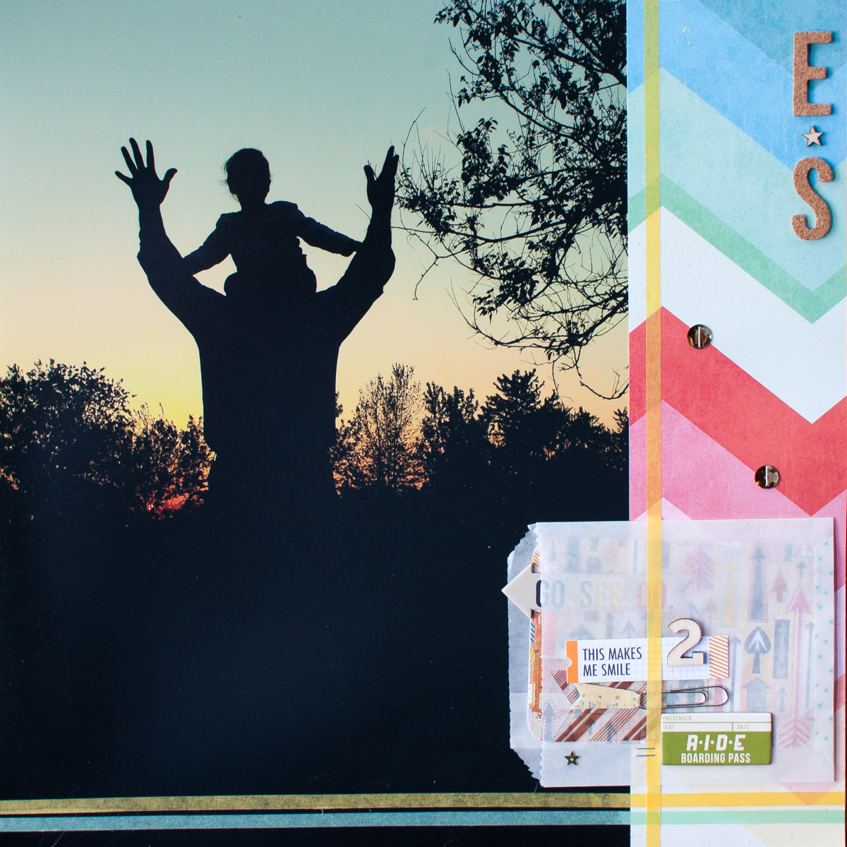
Note how the photos chosen for these layouts trend towards the casual and unposed.
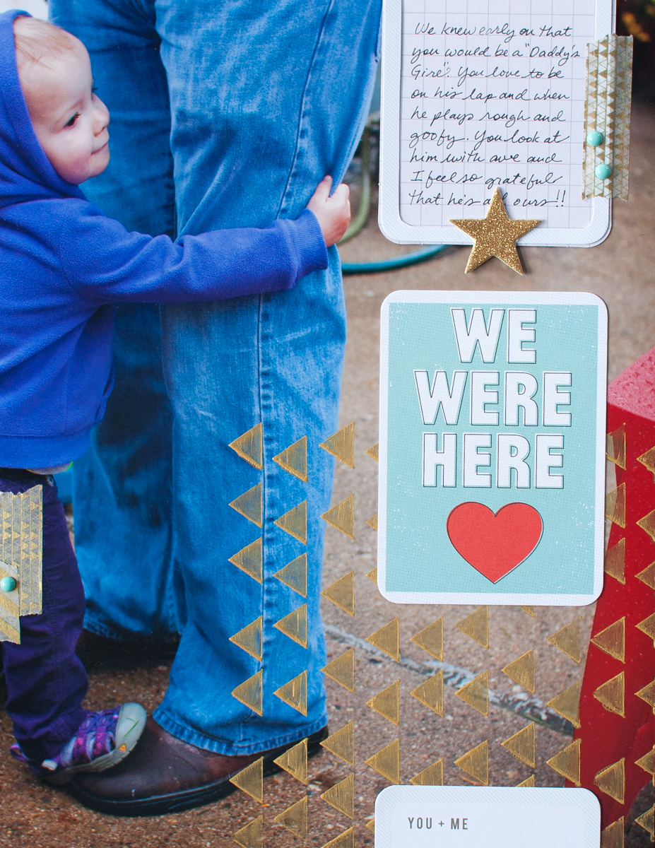
I will never paint the white wall in my kitchen. It is a scrapbooker’s perfect backdrop.
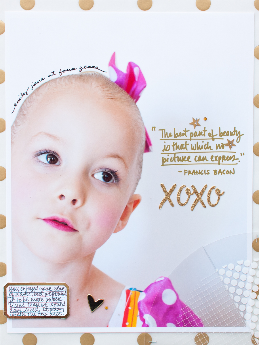
Have you ever used a photo as your scrapbook page background? Leave a comment (and an image if you like) sharing your experience with this technique.
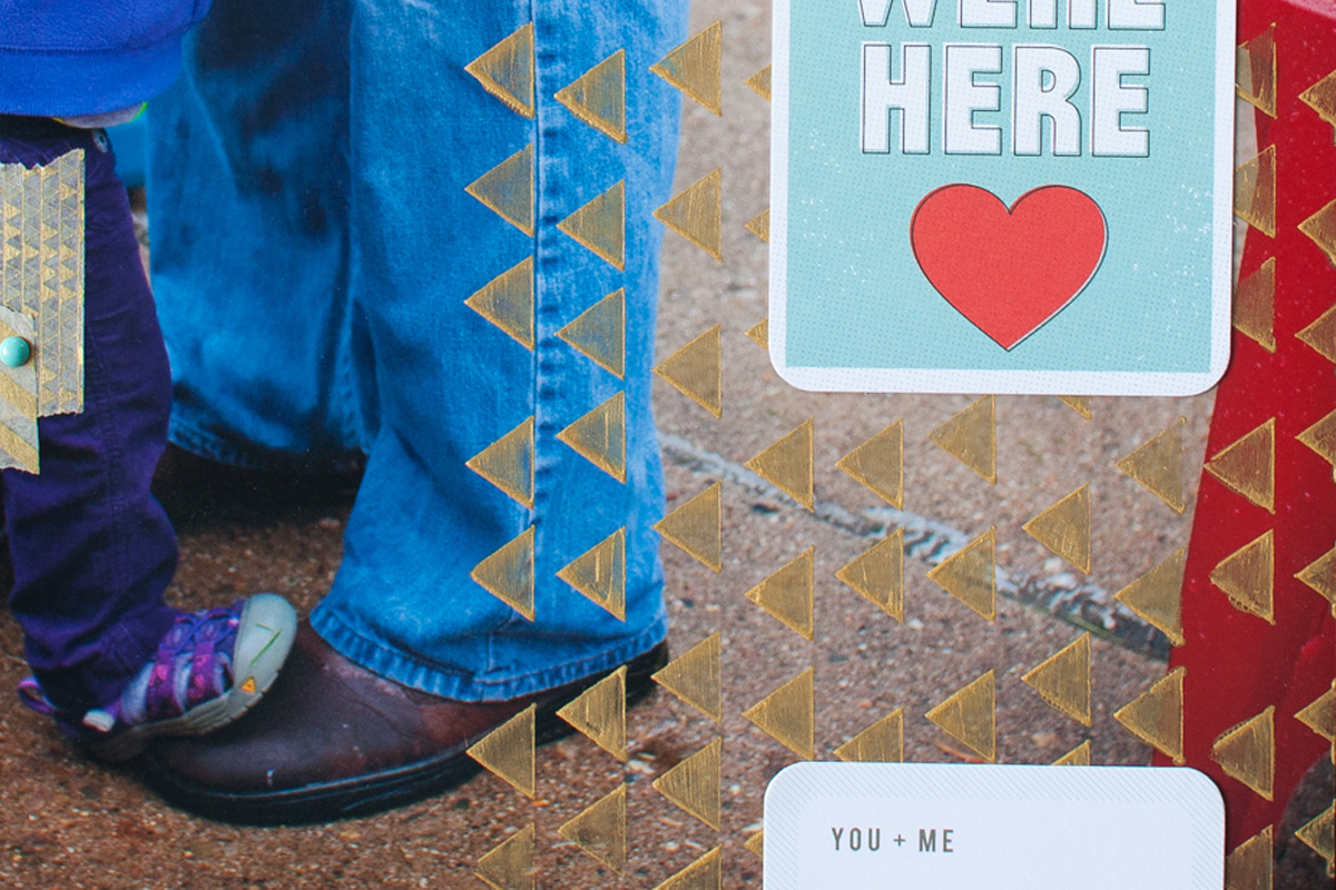
Love each of these layouts. I’ve never tried this technique, but may have to take on the challenge.
I forgot this beautiful idea, Jennifer! I have several photos that would go nicely as background paper. I’ve added one i would love to use, but is so dark. Any suggestions?
Trish, journal/embellish around the three dark edges…
Trish, do you have any editing software? If I were doing it in Lightroom I would lighten the shadows, sharpen the image, reduce the noise (which means to smooth out the graininess) and probably tweak the white balance so her face doesn’t have a blueish cast. If you don’t have software and you want to email it to me I can do it. (whimsyfox@gmail.com)
Trish, you could embrace the darkness, especially around the edges, as a good contrast to the light of the window – it certainly draws your attention to the center of the page and the little one featured there!
I have still never tested this technique, but I adore him. Mainly, for the project life.
I love doing full 12×12 enlarged photos! Printed a bunch on my Pro-100 from international travel that I’ve started playing with decorating.
If you don’t have a printer that prints 12×12 is there any place you can go that will do it for you ?
Debbie – The 12×12 size may be more popular than you’d think, especially for digital scrapbookers. It’d be worth checking with your regular photo developer, otherwise some developers I’ve personally used and would recommend for enlargements include Costco (pick up in store or mail order) or Persnickety Prints (mail order, unless you live in Utah where they are located). I hope this is helpful!