1, 2, or 3 photos are pretty easy to get on a layout. But what happens when you want to tell a story on a single page, but share 4, 5 or more photos? It’s not impossible at all, you just have to be clever with space and make sure to keep balance on the page.
These projects are a great time to check out templates, to save you time and frustration. Here are some great examples, some with a heavy geometric influence and some not:
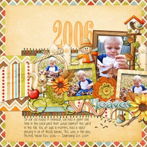
Loving the titled and heavily layered photos. Great font choice too!
I would have never thought to clip elements inside a box!
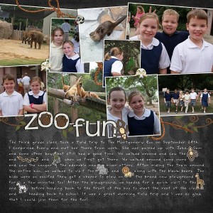
A great way to pair 4+ photos with lots of fun embellishments.
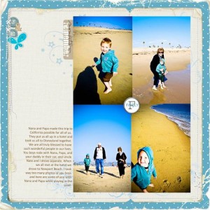
The stunning photos are the star here. Sometimes I forget about adjoining photos.
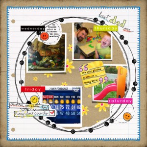
The photo placement totally works – it’s so fun how they are clipped within the circle.
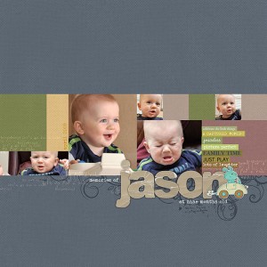
A beautifully blocked & simple tribute. The words art makes it sparkle.
The “painted” mask behind the photos ties this circle together.
I love stitching, but this artist LOVEs stitching. I need to use more of it!
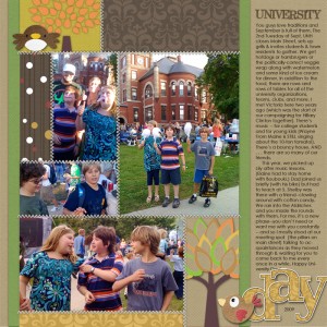
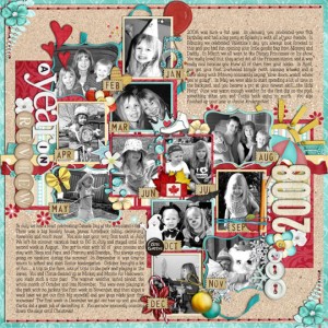
12 photos AND lots of journaling – a masterpiece!
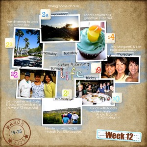
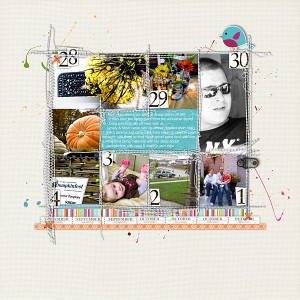
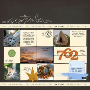
Using a calendar-type layout with photo blocks is timeless.
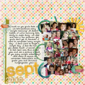
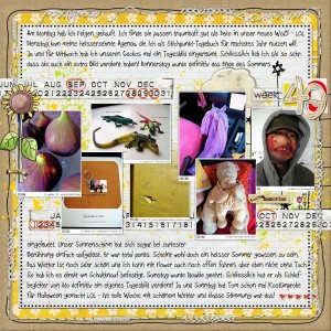
This collection of 23 images reminds of the photo collages I made as a teen!
This full, yet streamlined, page is super eye-appealing. It just works.
Bonus Tip: Re-purpose Project 365 templates to tell a big multi-photo story!
Do you create digital scrapbooking layouts with 4 or more photos? What do you think of these examples? How do you make multi-photo scrapping stress-free?
I’m a huge fan of templates, and my favorite multi-photo templates are normally some sort of grid design. I’m very much a clean and simple scrapper.
I couldn’t believe it when I saw my layout featured! Thank you so much! I just discovered this web site and I love it. I’ve downloaded some of your templates, thank you!
About multi-photo layouts, I’ve noticed sometimes people group B&W with color photos, and it always looks so good, but I’ve always been hesitant to try it. I’m afraid they won’t go together.
Definitely a great tip about using the 365 templates for multi-photo pages – I’m not doing P365, so whenever I’ve used those templates (for CT work), I always tell a story with them instead:) I love them!
I love multi-photo layouts. The ones I create myself tend to be pretty grid-like or simple, so I love when I find a good template or QP that can help me think outside the box and also with embellishment placement for something different in my albums.
These are great layouts. I really like the combination of lots of journaling with lots of photos.
I LOVE multi photo layouts! You’ve found some wonderful examples here! I made some Photo a Day (365) templates and find I use them a lot – so much I just made them into calendar templates! Thanks for highlighting these, great inspiration!
Awesome eye-candy post! And thanks so much for featuring my P365 layout. Which reminds me, I need to do some, LOL.