I’ve talked a lot about my definition of simple when it comes to your approach to memory keeping. I’ve encouraged you to seek outside inspiration, to find your perfect balance and to take baby steps to less stress. What I haven’t talked a lot about is how to translate this ethic specifically to your digital layout.
The arrival of Cathy Zielske to the Designer Digitals shop prompted a question (well, several) in my mind. Her products are studies in perfect design and typography. As we’ve come to appreciate and expect from CZ, her work is just beautiful and an epitome of simplicity. As I began seeing projects with her new templates in the galleries, I wondered if I was a simplicity imposter.
To test that theory, I found a freebie template that had been languishing in my stash. It was for a magazine-style ad challenge at Weeds & Wildflowers. I set out to see if that ultra-simple style would work for me.
While I am a big fan of using a grid to aid design (and I’m totally neurotic about things lining up), this type of layout drove me bonkers. I was worried about whether I had picked the right fonts and sized the minimal embellishments to be just right. I wondered if my products were too bold, if they were detracting from the vibrant photos. I missed layering papers (so I sneaked some into the background). In essence, it became work. I was no longer celebrating my memory, but trying to live up to an expectation.
This was just my experience, a test of my own style and design sensibilities. However, it left me wondering how our community, as a whole, views simplicity in scrapping.
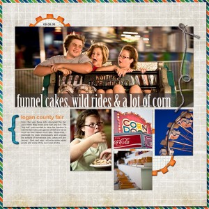
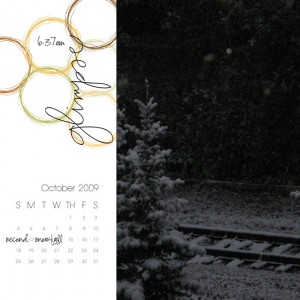
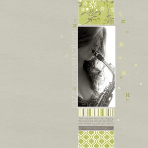
If I asked you to define simple in terms of digital layouts, you might offer up examples like these:
You would see white space, large photos, minimal elements and say “oh, that’s a great example.” I certainly wouldn’t disagree. However, is it possible for us to expand the definition?
I could probably get you to see that these fit the bill as well. There is no excess and the story is the focus.
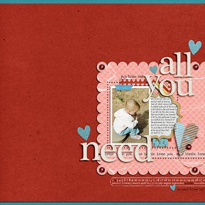
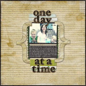
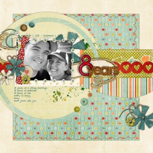
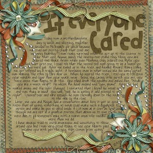
But what about these?
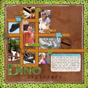
Do full, embellishment-heavy pages challenge your definition? At first glance, I’m certain they do.
Let’s go back to my experiment. I started with the question, am I a simplicity imposter? When my trial run with the ad-style template didn’t go so well, I was worried I’d have to re-name this blog “{Not So} Simple Scrapper.” But then I asked myself: what do you love about digital scrapbooking?
Then everything became crystal clear. I love combining my photos with fresh and colorful digital products. I love that even digital scrapbook pages can be imperfect, just like me. I love capturing, celebrating and elevating my story in a creative way that a simple photo album or basic photobook cannot accomplish. I love making time for honoring the memories of my life.
I realized then that I must define simplicity for myself and this blog. I wondered, can we craft a definition for the creative, modern & busy scrapper? To me, when you reduce it down, these are my basic elements of simple scrapping:
- Let your stories shine
- Use digital products you love
- Put your heart into each page
With these principles in mind, how do you view those last three examples? How do you define simple?
I really like your take on the magazine style template. It’s funny because how you described your thoughts while completing it are my thoughts on every page I do, LOL! I think I get overwhelmed by all the elements that are included in kits these days. I would describe the first set as simple, the second set is pushing it, to me and the last set is way beyond simple in my opinion. To me, the epitome of simple scrapbooking is Ali Edwards. Her stories are always the focus with the simple use of words and photos along with great design, clean lines and clean embellishments. I’m all over the place with my scrapping because I covet her work as well as those busy & beautiful pages that adorn galleries like Sweet Shoppe.
Great topic!
Like you Carri, I was feeling pulled in different directions. I keep bookmarking those super clean pages. But when it comes down to creating a page, I feel much more comfortable combining that look with a more vibrant, cluster-y & layered-paper-y style.
I think simple is anything that helps me get pages DONE. Faster. That’s why I like templates, pre-made clusters or frames with stuff attached, and also simple layouts like you showed. I just did a whole series of layouts where each page has one alpha letter and one element, photos and journaling. No bg paper (just white), very simple grid layout. But WOW – the element and alpha POP off the page, and nothing is competing with my very colorful photos. And once I got the idea, I was able to knock out 3 more matching pages, using up all the photos from the event, and varying the layout just a little on each one. So there’s a simple idea- take one layout and re-arrange it for ‘matching’ layouts! Simple!
Can you share a link to your series Jenn? I’d love to see those pages.
Oh, now I’ll have to actually post them somewhere! (Here I have my own gallery on our site, and I’m terrible about getting around to posting things!) Ok, here’s the first one, I put the next two up too just scroll over to see them. I like the contrast of the crisp white bg with the strong black strokes around the photos, and the warm, rustic texture of the elements. This is not my usual style at all, but it works well with these busy, colorful photos! I think as a book it will look wonderful. I started thinking I’d do 4-6 pages, but I have enough photos to do a small book – 10-20 pages! http://www.scrappersworkshop.com/gallery/showphoto.php/photo/312/ppuser/2
I’ve been digital-scrapbooking for almost three years now–how is it that I just discovered your site?! It’s beautiful, and I’m having a great time exploring. Thanks for your wonderful work!
Great topic! Like you, I think simple scrapping is different for everyone. Whatever is important to you, the scrapper and fits your definition of the word.
Jenn White, posting above, hit the nail on the head. I think you’re conflating the definition of simple. The way you’re using it based on the 3 principles is simple = what’s easy for the individual, what comes to them effortlessly, how they scrap when they’re “in the zone,” as it were. That’s not wrong, that’s ideal. But I don’t call it “simple” if you’re trying to attach that terminology to layouts.
By your criteria, the last 3 lo’s fit as long as they were easy for their creators to make. “Simple,” as used by CZ and those in the Simple Scrapbooking fan club, is bare bones and minimalist. I, too, find these kind of layouts very difficult to pull off because I’m so used to having dozens of layers in my file and to moving things around a hundred times before they suit me. I admire the minimalist layouts, sure. But, much as I wish they were, they’re not my style.
I was purposefully conflating these two ideas to illustrate that Simple Scrapper is accepting and encouraging of all styles of layouts, and that our premise is making scrapping fit within your lifestyle (i.e. that I’m not a simplicity imposter because I don’t create minimalist layouts). Our shortcuts help make the process take less time, but the mental hurdle is often the biggest. Focusing on personal stories and products that make you giddy help breach that barrier to getting pages completed. Those last three are simple to me primarily because they include substantial journaling.
I never imagined that the “simple” had anything to do with what the finished layout looked like. I assumed it referred to anything in the form of techniques/supplies/encouragement/prompts/philosophy that enables us to create the documents we want to create.
To me, the only thing that makes scrapping NOT simple is the competitiveness of it, online anyway. I know people praise each other’s layouts, but with all the contests out there, and the competitiveness of being on creative teams, you always wonder if you measure up. And it seems very clique-y to me. It’s still fun to participate online, but I have to remember that I do this for myself, not to receive praise (but praise feels so good….)
I certainly agree there is competitiveness in this community. There are good and bad aspects to that. One way it can be positive is through encouraging creative growth.
I agree, Tiffany, it does get competitive and clique-y. Just like anything really – we had to stop doing baskets for our PTO auction because some of the moms went so overboard trying to ‘outdo’ each other, that the rest of us were priced out of participating! So make the clique thing work for you. Find a group of scrappers with similar styles or attitudes to yours and hang out there. I know I really rely on my Thursday night crop gang to keep me inspired and remind me that it’s MY story and all that matters is how I want to tell it!
To me, the basis of simple scrapbooking is good design, story telling, and less “stuff”. How we interpret that is a personal choice and open for interpretation.
Now, according to my own definition, I would call the first set of pages simple and the second set, while beautiful, not-so-simple.
I think that you are going to two different views on what defines “simple scrapbooking”. There are those who were fans of the magazine and like the minimalist approach, and those who scrapbook by their own rules and define “simple” as a quick or easy approach.
I’m enjoying this conversation. I, along with everyone else, I think, believe that it’s about what’s simple for me. For me, using embellishments is often a struggle. One, two, MAYBE three per page most of the time. The very sight of some clusters that people include make me feel overwhelmed. Using lots of white space is fine, but I have a hard time figuring out how to make it look good, so I rarely do unless I’m using a template. Using alpha stress me out, when I can just pick a font I like. Papers, photos, text, and using up lots of space are what are generally simple for me.
I think how I define simple is similar to your definition. For me, part of the joy of digital scrapbooking is the ability to complete pages faster. Because honestly, my pictures are not telling stories by sitting on my hard drive.
So, I keep things simple by: using templates, using LOTS of pictures, keeping my papers simple and trying to tell the story. Telling the story is sometimes hard for me.
I don’t use a lot of embellishments on my pages…maybe a ribbon here or there. I’ve started deleting elements from kits when I download them since I never use them.
Thanks for spurring this discussion. I’m enjoying reading the conversations!
I know I’m late to this conversation but I really enjoyed this post. I have always thought of simple and minimalist together, mostly I guess because that is what is simple for me. You gave me a new perspective. Great post 😀